That’s a wrap! It’s certainly been an interesting semester, but now I am ready to put it behind me. Reflecting on the spoon project, I have some final thoughts and observations. First, I want to thank the fine folks at CMU School of Design. From the amazing and hardworking faculty and graduate student cohort, I have had nothing less than inspiration and encouragement throughout this entire process, despite the obvious challenges of working remotely.

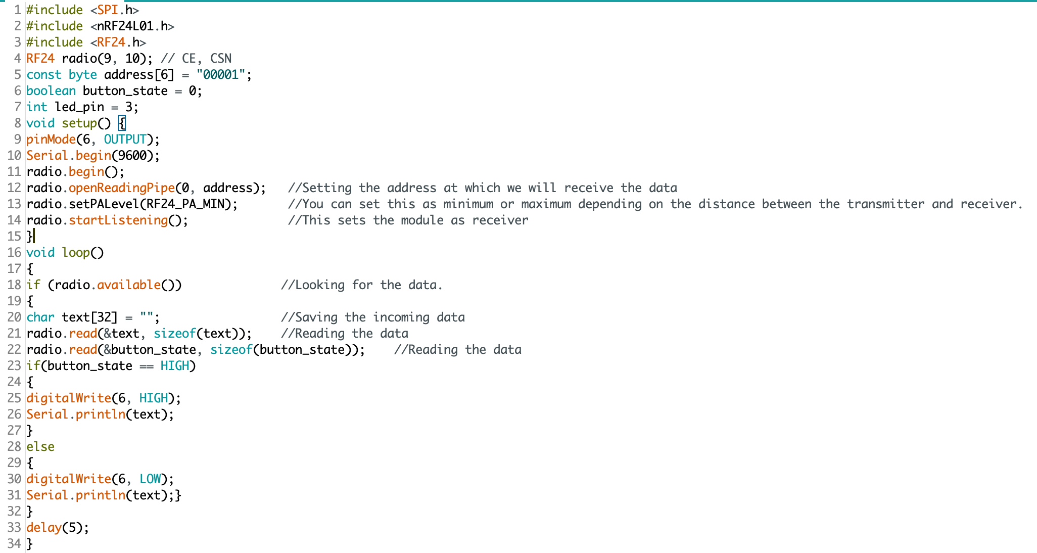
Rendering of sixth and final (?) spoon design. I pulled the kitchen design (Pierre Gilles) and bowl (Damogran Labs) from GrabCad.com. The spoon and coffee mug are mine.
This project was divided into two parts: the first part focused on exploring different ways of prototyping and making. This was described to me as an informal way of A/B Testing for methods. The second part involved the deliberate iteration of prototypes through user testing — a challenge in the context of a global pandemic and social distancing. To make the most meaningful design choices possible given limited resources, I decided to leverage the power of physical simulation to supplement the making of physical prototypes.
There are a variety of 3D software tools that offer some degree of physical simulation. For this project, I selected Maxon Cinema 4D R20 (Educational License) and Blender as my two ways of making. I chose these because I already am familiar with Cinema 4D and understand know how to manage a workflow in that context, because Blender is open source and free for anyone to use, and both programs work under MacOS and Windows environments (my rendering workstation is a Hackintosh with multiple operating systems, which grants the flexibility to overcome certain technical limitations). My initial experiments with Cinema 4D were… not great.
As you can see, there are “physics” happening here, but they are not anything close to the physics of the real world. This is not “real world” physics, this is Asshole Physics:
Zachary "Spokker Jones" Gutierrez and I came up with the term "Asshole Physics" when we were discussing the game and the physics models it employed. Basically there's a lot of crap you can knock over and kick around, including dead bodies, buckets, cans, and little sections of drywall which are standing around in the middle of rooms for no obvious reason. Zachary casually mentioned, "I have made it a point to knock over every fucking thing in that game. I am living out my fantasies of being a giant asshole," and I responded by stealing his "asshole" comment and claiming that I made it up. Thus "Asshole Physics" was born.
Without more sophisticated plugins to simulate fluid, Cinema 4D R20 is only “out of the box” capable of non-newtonian semisolids. I can make stuff bump around and “squish.” I can have a 3D character micturating on the side of a building. I can create the appearance and illusion of something like a fluid, but with such restrictions, I could not realistically evaluate my spoon designs. I explored my options and found that Next Limit’s RealFlow plugin would meet my basic needs. Best of all, they offer a free 30-day trial! My initial excitement quickly waned after the plugin failed to install and activate on my system…
(This email chain is long and covers a week of back and forth with customer service. I am including the entire conversation as a way to recreate my experience. While this may not directly relate to the scope of this project, I still believe that there is value in documenting the unexpected problems that crop up when trying to do something new.)


It took a week to finally get everything sorted with the demo. During that time, I began to explore option B: Blender.
Blender is a free, powerful, open source 3D creation tool. Best of all, it includes the mantaflow fluid simulation engine (since version 2.8). I have worked with Cinema 4D on other projects, and have become fairly comfortable with the interface. Given my experience with Fusion 360, Inventor, and C4D, I knew that I would need to overcome a learning curve before I could use this software to meet my needs for this project. Fortunately, I was able to find a spectacular tutorial series for beginners.
If you want to read more about my experience with the tutorial, click here.

This tutorial was ideal because it involved exercises that helped me learn how to use the interface, and covered several different workflows. I was really impressed with Blender’s node-based material system and procedural textures. You can work strictly with parametric modeling, or you can discretely modify mesh geometry to create highly organic and imperfect forms. I’m excited to work with Blender on future projects. It’s a very exciting time to be working in 3D.
While working through these tutorials, I began sketching and working in Fusion 360 to craft my first spoon designs for part 2 of this project. You can read more about this experience here.
Takeaways from Part 1
I really appreciated the responsiveness from the team at Next Limit. Clearly there are problems with the software’s implementation of their product’s copy protection. This is an all-too-common problem in the world of software. Programmers gotta eat just like everybody else, and we certainly should make sure that the talented and hardworking folks behind the code are able to put food on their table at the end of the day. Piracy can deprive a small business of the necessary revenue to keep the lights on, so I am absolutely sympathetic to this reality and what risks are involved when you release your software for demo purposes. Getting people to pay for something that they can easily get for free is a challenging proposition. At the same time, you cannot realistically expect to get customers to pay for software if they cannot try it first. Ultimately, this one week of back and forth with customer support was a critical loss. I never completed a side-by-side comparison of fluid simulations. While I did eventually succeed at installing and using RealFlow to do fluid simulations, (and was honestly impressed with how easy it was) I did not, however, have enough time to setup a comparable simulation to evaluate spoon designs. My trial expired about a week ago, and I see this aspect of the project as a lost opportunity. If Next Limit applied similar licensing practices as Maxon (verify it through .edu email address), they could offer an educational package of their RealFlow plugin.
Blender really came through for me. The learning curve was aggressive, but not impossible. While I found mantaflow to be a respectable and entirely capable fluid simulator, it was not without its own share of issues. I spent a lot of time making granular tweaks to improve the fidelity of my simulations, while also using the observations from my simulations to inform design decisions for my spoons in part 2 of this project.
Part 2: Design Iterations Based on User Testing
While this project required user testing and design iterations based on feedback, I decided to limit the user evaluations to address handle shape and the spoon’s overall dimensions. This was not an arbitrary decision or an excuse to focus on physical simulation of fluid dynamics (with user testing as an aside). No, this decision was based on the nature of the course from which it was assigned: Prototyping for Interaction Design. This semester I have have been focusing on designing for interaction (arguably, all designers do, at some point in their process, focus on this aspect). When thinking about the tools we use (to eat food) as a system, it is important to consider the touchpoints involved. The handle of a spoon is a non-trivial component. It can take on many forms, and naturally includes affordances. How someone holds a spoon, and how easy it is for them to use it are central to the evaluation of the design.
The iterations of design were highly generative in nature, inspired by both user evaluations and physical simulations, I maintained a homeomorphic continuity: treating the initial shape as an elastic form to be molded and reshaped to maximize performance. Knowing how a concave shape might be optimized to perform under rapid movement — I wanted to create something that would be useful, and the physical simulation of fluids facilitated a means of evaluation — is only one aspect of a more complicated interaction, and this test alone could not fully address human needs. When physical form is designed and directed to improve user interaction (and physical properties are given equal consideration), it is possible to create a truly useful tool. I realize that this is a very technical description, but it is easier to understand when properly visualized. I have rendered a compilation sequence to show how this spoon shape evolved to its final(?) form (I am still considering a physical prototyping stage for this project over the summer).
A sequence of fluid dynamics tests designed to evaluate fluid retention of concave forms. Carnegie Mellon University, School of Design, Prototyping for Interaction, Spring 2020.
Toward the latter half of this sequence, you will notice a change in colors (for both the liquids and spoons). I decided to differentiate the final rendering sequences as these were based on user evaluations. The colors chose for these final sequences are based on the color tags used for the user test:

These printouts are derived from DXF vector images exported from Fusion 360. The designs shown are oldest (top) to newest (bottom). The fifth design (blue) is rendered with a blue body and green liquid.
I printed and mailed the paper prototype to a potential user suffering from ongoing hand tremors (my partner’s mother). I sent this without written instructions. Instead, I only provided different color tags to facilitate feedback. My user let me know that the red spoon handle was in the “Goldilocks” zone in terms of size and shape: not too big, not too small, not too curvy, not too straight. Using this feedback I constructed the sixth and final (?) form — see the first image of this post.

The user test included a direct side-by-side comparison with existing dinnerware.
Before developing these simplified paper prototypes, I also experimented with ways of making more three-dimensional forms that could be sent in the mail. While this novel approach showed some potential, I was concerned with how user error might complicate or (even worse) bias feedback. Still, these paper prototypes helped me to better understand and interpret the scale of my 3D models.

Final Thoughts
This project still feels somewhat incomplete. Perhaps this is because the generative design process itself can always demand further iteration, or maybe it is because I have not yet created a physical prototype that can actually be tested as an eating instrument. Maybe it is only because there were still a few “rogue droplets” (grrrrrr) that I simply could not keep contained with the completion of my sixth iteration. Whatever the net effect might be from these various shortcomings, I am pleased with the learning opportunities that were presented throughout this exploration of design.
Were I to continue with this process, the next steps would be to 3D print the latest shape using a food-safe material (there are a few third-party vendors that offer this service). I would then ship that latest design for further user evaluation. I believe that there are still many additional iterations necessary before I could defend having created something that satisfies the criteria I set out with this project (i.e., a spoon that overcomes the challenges of involuntary muscle movements and essential tremors).
If I were to collaborate with others, I would also want to evaluate the ecological and economic impact of such a device. How might we go about manufacturing to appropriate scale? How might additional user tests with a wider audience influence the existing form? There remains many unanswered questions and a newfound respect for the power of generative design.