Amid the chaos of a world in crisis, I’ve found hope in an unexpected place: coding. With tools like Claude.ai and MCP, I’ve been building a web app to help food pantries serve their communities better—automating inventory, breaking language barriers, and streamlining processes. This isn’t just about code; it’s about turning anxiety into action, using technology to create something meaningful. If you’ve ever wondered how AI can amplify human effort, this is a story for you.
Read MoreWeek 12 Update: Evaluative Research Presentation and Reflection on Reaching The Project's Final Stage
This week our team presented our evaluative research to Prospect Studio (Fiona and other representatives were asynchronous for this session) and our guest, Arnold Wasserman. This presentation is the last before our final deliverable, and represents the conclusion of our research phase. While there are some loose ends for us to address (and further evaluation of our concept has not yet been attempted), we are now in the early stages of artifact synthesis.
The last few weeks have helped our team to understand the importance of user evaluation, what strategies do and do not work well in a remote/online context. In particular, we learned that building a survey is a miniature design project unto itself. The creation of an interactive system, and evaluating the results required significant labor up front and a lot of uncertainty throughout. Nevertheless, I feel that our team was successful in achieving specific goals.
I’m proud to say that we managed to get several different concepts in front of several educators from around the country as well as from within PPS specifically. We successfully navigated and sorted through feedback to gauge overall patterns of responses to several concepts as well as system-level evaluations. We managed to coordinate and divide our labor effectively, and communicated asynchronously as we brought key components together. This process was mirrored in the creation of our latest slide deck for Wednesday.
We received helpful feedback and challenges to our concept following our team’s presentation. As previously has been the case, our team had a good sense of who ought to respond to specific questions, since our divided labor has granted each team member some degree of specialization and familiarity with the topic we’ve been researching. Specifically, Arnold Wasserman was curious about how our artifacts could communicate these concepts in a compelling and persuasive manner. Arnold Wasserman pointed out that school boards and the people elected to them, have a tendency to be self-serving, to the detriment of the districts they represent. He questioned how our concepts would overcome the significant obstacle of implementation, especially given the fact that school boards and public officials hold the levers of power and the teachers are functionally an underclass in the United States.
This is something I’ve been thinking about since the beginning of this project, and I related back to these thoughts in response. My ideas are largely based on the work of Donella Meadows, and her famous essay on leverage points.
PLACES TO INTERVENE IN A SYSTEM
(in increasing order of effectiveness)
12. Constants, parameters, numbers (such as subsidies, taxes, standards).
11. The sizes of buffers and other stabilizing stocks, relative to their flows.
10. The structure of material stocks and flows (such as transport networks, population age structures).
9. The lengths of delays, relative to the rate of system change.
8. The strength of negative feedback loops, relative to the impacts they are trying to correct against.
7. The gain around driving positive feedback loops.
6. The structure of information flows (who does and does not have access to information).
5. The rules of the system (such as incentives, punishments, constraints).
4. The power to add, change, evolve, or self-organize system structure.
3. The goals of the system.
2. The mindset or paradigm out of which the system — its goals, structure, rules, delays, parameters — arises.
1. The power to transcend paradigms.
In particular, look at points three and four: the power to self organize and the goals of the system are key to understanding the forces necessary to reform PPS to more closely resemble the vision from Prospect Studio. I agree with Arnold Wasserman’s observation regard the school boards and policy makers, but I also see a real opportunity with this difficult and problematic group. They hold the levers, so we need only find a way to align their goals with the reforms we envisions for PPS.
If we accept the premise that politicians and school board members care about their own tenure and individual interests, and do so above all other considerations, then what we need to produce are artifacts that provokes the parents and registered voters of that school district. Once an activated and inspired public knows what they desire, they will vote for and ultimately elect representatives who promise to bring that vision to life. We have seen this on matters ranging from civil rights and infrastructure, to economics and war. Politicians will follow public pressure to keep their own seats warm.
Arnold seemed pleased with my answer, and suggested that our topic relates directly to the fate of our nation’s democracy — so, no pressure at all!
This weekend our team held three meetings to jumpstart this process of future artifact synthesis, and we have been more or less fruitful in this endeavor. It’s exciting to be in the final stretch, but our team has been struggling to maintain momentum lately. The demands of presentation weeks, and the rush to complete our research, often requires long hours, multiple zoom meetings outside of class, and many late nights. This has began to produce negative health consequences for our team.
We’ve been intensely looking at teacher burnout, but have also been confronted with the burnout of a pandemic, and the rigorous academics of a graduate program. Illness, headaches, and signs of exhaustion have crept into our team dynamic, and I’m concerned about what this will mean now that we are heading into the final push for this semester. What we really need at this stage is that spark of creativity and divergent thinking. It’s hard to do this level of work while also pushing up against the steady hum of stress and exhaustion.

Brainstorming session, mapping events and trends to eventual implementation of key ARC concepts
I think it was a gigantic error on the part of CMU to breakup our spring break. I understand the rationale, and the concerns around travel, but this alternative strategy of giving students a random Monday or Tuesday off has not provided the benefits of time off to rest. I simply cannot “sleep faster” when given a 24 hour window, and I cannot catch up when one day of classes is omitted from an otherwise packed calendar. I’m burned out. I’ve got this strange ringing in my ear that won’t let up, and I’m having more trouble concentrating than at any other time this year.
Languishing in the fog of constant deadlines, constant tasks, constant meetings, constant emails, Slack messages, updates, etc., etc., have left me depleted. It has also sucked the joy out of doing this work. I hope this terrible mental and physical state doesn’t last, because I don’t see how I can be productive while feeling this way.
Kinetic-friendly spoon project Mega Post
That’s a wrap! It’s certainly been an interesting semester, but now I am ready to put it behind me. Reflecting on the spoon project, I have some final thoughts and observations. First, I want to thank the fine folks at CMU School of Design. From the amazing and hardworking faculty and graduate student cohort, I have had nothing less than inspiration and encouragement throughout this entire process, despite the obvious challenges of working remotely.

Rendering of sixth and final (?) spoon design. I pulled the kitchen design (Pierre Gilles) and bowl (Damogran Labs) from GrabCad.com. The spoon and coffee mug are mine.
This project was divided into two parts: the first part focused on exploring different ways of prototyping and making. This was described to me as an informal way of A/B Testing for methods. The second part involved the deliberate iteration of prototypes through user testing — a challenge in the context of a global pandemic and social distancing. To make the most meaningful design choices possible given limited resources, I decided to leverage the power of physical simulation to supplement the making of physical prototypes.
There are a variety of 3D software tools that offer some degree of physical simulation. For this project, I selected Maxon Cinema 4D R20 (Educational License) and Blender as my two ways of making. I chose these because I already am familiar with Cinema 4D and understand know how to manage a workflow in that context, because Blender is open source and free for anyone to use, and both programs work under MacOS and Windows environments (my rendering workstation is a Hackintosh with multiple operating systems, which grants the flexibility to overcome certain technical limitations). My initial experiments with Cinema 4D were… not great.
My very first (and failed) attempt to simulate fluids in Cinema 4D.
Carnegie Mellon University
School of Design
Prototyping for Interaction
Spring 2020
As you can see, there are “physics” happening here, but they are not anything close to the physics of the real world. This is not “real world” physics, this is Asshole Physics:
Zachary "Spokker Jones" Gutierrez and I came up with the term "Asshole Physics" when we were discussing the game and the physics models it employed. Basically there's a lot of crap you can knock over and kick around, including dead bodies, buckets, cans, and little sections of drywall which are standing around in the middle of rooms for no obvious reason. Zachary casually mentioned, "I have made it a point to knock over every fucking thing in that game. I am living out my fantasies of being a giant asshole," and I responded by stealing his "asshole" comment and claiming that I made it up. Thus "Asshole Physics" was born.
Without more sophisticated plugins to simulate fluid, Cinema 4D R20 is only “out of the box” capable of non-newtonian semisolids. I can make stuff bump around and “squish.” I can have a 3D character micturating on the side of a building. I can create the appearance and illusion of something like a fluid, but with such restrictions, I could not realistically evaluate my spoon designs. I explored my options and found that Next Limit’s RealFlow plugin would meet my basic needs. Best of all, they offer a free 30-day trial! My initial excitement quickly waned after the plugin failed to install and activate on my system…
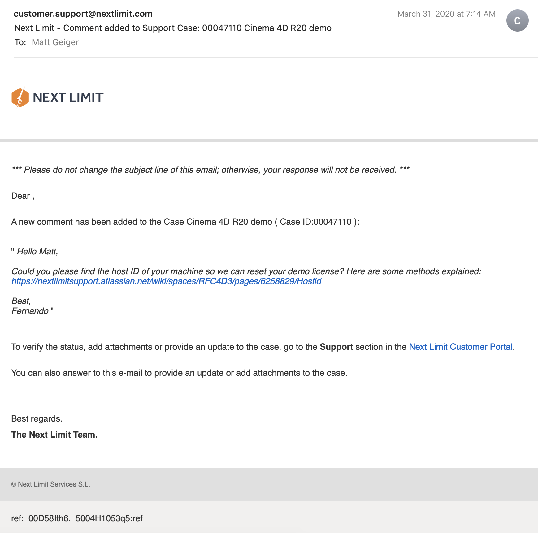
(This email chain is long and covers a week of back and forth with customer service. I am including the entire conversation as a way to recreate my experience. While this may not directly relate to the scope of this project, I still believe that there is value in documenting the unexpected problems that crop up when trying to do something new.)


It took a week to finally get everything sorted with the demo. During that time, I began to explore option B: Blender.
Blender is a free, powerful, open source 3D creation tool. Best of all, it includes the mantaflow fluid simulation engine (since version 2.8). I have worked with Cinema 4D on other projects, and have become fairly comfortable with the interface. Given my experience with Fusion 360, Inventor, and C4D, I knew that I would need to overcome a learning curve before I could use this software to meet my needs for this project. Fortunately, I was able to find a spectacular tutorial series for beginners.
If you want to read more about my experience with the tutorial, click here.

This tutorial was ideal because it involved exercises that helped me learn how to use the interface, and covered several different workflows. I was really impressed with Blender’s node-based material system and procedural textures. You can work strictly with parametric modeling, or you can discretely modify mesh geometry to create highly organic and imperfect forms. I’m excited to work with Blender on future projects. It’s a very exciting time to be working in 3D.
While working through these tutorials, I began sketching and working in Fusion 360 to craft my first spoon designs for part 2 of this project. You can read more about this experience here.
Takeaways from Part 1
I really appreciated the responsiveness from the team at Next Limit. Clearly there are problems with the software’s implementation of their product’s copy protection. This is an all-too-common problem in the world of software. Programmers gotta eat just like everybody else, and we certainly should make sure that the talented and hardworking folks behind the code are able to put food on their table at the end of the day. Piracy can deprive a small business of the necessary revenue to keep the lights on, so I am absolutely sympathetic to this reality and what risks are involved when you release your software for demo purposes. Getting people to pay for something that they can easily get for free is a challenging proposition. At the same time, you cannot realistically expect to get customers to pay for software if they cannot try it first. Ultimately, this one week of back and forth with customer support was a critical loss. I never completed a side-by-side comparison of fluid simulations. While I did eventually succeed at installing and using RealFlow to do fluid simulations, (and was honestly impressed with how easy it was) I did not, however, have enough time to setup a comparable simulation to evaluate spoon designs. My trial expired about a week ago, and I see this aspect of the project as a lost opportunity. If Next Limit applied similar licensing practices as Maxon (verify it through .edu email address), they could offer an educational package of their RealFlow plugin.
Blender really came through for me. The learning curve was aggressive, but not impossible. While I found mantaflow to be a respectable and entirely capable fluid simulator, it was not without its own share of issues. I spent a lot of time making granular tweaks to improve the fidelity of my simulations, while also using the observations from my simulations to inform design decisions for my spoons in part 2 of this project.
Part 2: Design Iterations Based on User Testing
While this project required user testing and design iterations based on feedback, I decided to limit the user evaluations to address handle shape and the spoon’s overall dimensions. This was not an arbitrary decision or an excuse to focus on physical simulation of fluid dynamics (with user testing as an aside). No, this decision was based on the nature of the course from which it was assigned: Prototyping for Interaction Design. This semester I have have been focusing on designing for interaction (arguably, all designers do, at some point in their process, focus on this aspect). When thinking about the tools we use (to eat food) as a system, it is important to consider the touchpoints involved. The handle of a spoon is a non-trivial component. It can take on many forms, and naturally includes affordances. How someone holds a spoon, and how easy it is for them to use it are central to the evaluation of the design.
The iterations of design were highly generative in nature, inspired by both user evaluations and physical simulations, I maintained a homeomorphic continuity: treating the initial shape as an elastic form to be molded and reshaped to maximize performance. Knowing how a concave shape might be optimized to perform under rapid movement — I wanted to create something that would be useful, and the physical simulation of fluids facilitated a means of evaluation — is only one aspect of a more complicated interaction, and this test alone could not fully address human needs. When physical form is designed and directed to improve user interaction (and physical properties are given equal consideration), it is possible to create a truly useful tool. I realize that this is a very technical description, but it is easier to understand when properly visualized. I have rendered a compilation sequence to show how this spoon shape evolved to its final(?) form (I am still considering a physical prototyping stage for this project over the summer).
A sequence of fluid dynamics tests designed to evaluate fluid retention of concave forms. Carnegie Mellon University, School of Design, Prototyping for Interaction, Spring 2020.
Toward the latter half of this sequence, you will notice a change in colors (for both the liquids and spoons). I decided to differentiate the final rendering sequences as these were based on user evaluations. The colors chose for these final sequences are based on the color tags used for the user test:

These printouts are derived from DXF vector images exported from Fusion 360. The designs shown are oldest (top) to newest (bottom). The fifth design (blue) is rendered with a blue body and green liquid.
I printed and mailed the paper prototype to a potential user suffering from ongoing hand tremors (my partner’s mother). I sent this without written instructions. Instead, I only provided different color tags to facilitate feedback. My user let me know that the red spoon handle was in the “Goldilocks” zone in terms of size and shape: not too big, not too small, not too curvy, not too straight. Using this feedback I constructed the sixth and final (?) form — see the first image of this post.

The user test included a direct side-by-side comparison with existing dinnerware.
Before developing these simplified paper prototypes, I also experimented with ways of making more three-dimensional forms that could be sent in the mail. While this novel approach showed some potential, I was concerned with how user error might complicate or (even worse) bias feedback. Still, these paper prototypes helped me to better understand and interpret the scale of my 3D models.

Final Thoughts
This project still feels somewhat incomplete. Perhaps this is because the generative design process itself can always demand further iteration, or maybe it is because I have not yet created a physical prototype that can actually be tested as an eating instrument. Maybe it is only because there were still a few “rogue droplets” (grrrrrr) that I simply could not keep contained with the completion of my sixth iteration. Whatever the net effect might be from these various shortcomings, I am pleased with the learning opportunities that were presented throughout this exploration of design.
Were I to continue with this process, the next steps would be to 3D print the latest shape using a food-safe material (there are a few third-party vendors that offer this service). I would then ship that latest design for further user evaluation. I believe that there are still many additional iterations necessary before I could defend having created something that satisfies the criteria I set out with this project (i.e., a spoon that overcomes the challenges of involuntary muscle movements and essential tremors).
If I were to collaborate with others, I would also want to evaluate the ecological and economic impact of such a device. How might we go about manufacturing to appropriate scale? How might additional user tests with a wider audience influence the existing form? There remains many unanswered questions and a newfound respect for the power of generative design.
Human Factors of Paqui's One Chip Challenge
This is an evaluation of human factors applied to a novelty food item: Paqui’s “One Chip Challenge.”
Consider these human factors:
Physical Factors
Packaging:
- Casket shaped box, with thumb-sized semicircular cutouts
- Single envelope, with tear-open notch for easy opening
Cognitive Factors
Graphics:
- Grim Reaper and red skull imagery to emphasize spicy content
- Interior and exterior text warn users of what to expect
Emotional Factors
Experience:
- The anticipation of something spicy
- Discomfort, pain, endorphins
- Relief and a sense of accomplishment