Today’s quote: “Design is the process of turning existing situations into preferred ones.”
I’m still getting settled in Pittsburgh, and probably will be through most of the fall semester. Orientation was exciting but also a bit draining, The cohort is exceptionally social. I’ve never seen anything like it. These folks are bright, ambitious, quirky, and fun. We’ve gotten along well on a few outings, and I am seeing a lot of sincere effort to be open and engaging. I’m still feeling closed off at times, and pressured to say or do “the right thing.”
Not ethically, of course - that comes easily. Doing what is right is most easily expressed when helping others. EX: I helped a member of the cohort (they live in the same neighborhood) move a new couch to their apartment. We ran into some unfortunate constraints, and they had to borrow a hacksaw - seriously. How’s that for creativity? Christianne and Diana are genuine innovators!
When I say “the right thing,” I am referring to some Platonic Ideal for socializing in the presence of great minds. My peers are impressive in so many ways, and I want to add value to their experience here. I know that we will all struggle (in some way) to adapt, and will need to be present for one another to help bridge those gaps. I know how precious those kinds of resources can be, and how powerful the bond can be when people struggle together towards a goal. I also how important it is to foster a positive and enthusiastic environment.
I know these things because these were some of the lessons I learned when Jon Davis and I completed our Surface Warfare qualifications. After we got pinned, there was a solid two-week period where we constantly took turns pointing at the other’s chest and saying with a grin: “lookin’ good!” I feel a strong sense of responsibility to encourage that here. So far, I have every reason to believe that I am not alone in wanting to make this happen.
I cannot say enough good things about this cohort. These folks have an incredible range and scope - both in terms of knowledge and experience. There is a wide range of professional and academic experiences: geology, neuroscience, psycholinguistics, UX design, art, business and project management, cognitive science, Industrial Design, and much, much more. They are adventurous travelers and risk takers who find joy in hiking through the woods and sharing a favorite poem. They speak seriously about wanting to change the world. And I think they have a real shot at it.
I’m trying my best not to be cynical. Eustina somehow manages to be cynical while also being likable (and also very cool). Maybe she can teach me that trick. I am also (in the interest of transparency) a little bit worried about the age differences: I strongly suspect that I am the oldest one here, but the age gap is probably under ten years in most cases. I don’t really know why this bothers me. My age is coupled with a lot of experience, but makes me feel a bit insecure. Or maybe it is that the feeling of being insecure is being rationalized after the fact, and age is an easy scapegoat. Who knows?
The facilities here are incredible: there’s a fully functional robotic information desk with old school Dr. SBAITSO/Hawking synthetic speech generator and CGI rendered on-screen persona, a lab for 3D printing and laser cutting, a wood shop with all of the essentials, a computer lab with dozens of iMac Pros, and lots more. I even stumbled by their cleanroom (which gave me flashbacks).
Nothing is perfect however, and this school definitely has its quirks. The CUC locker rooms are on the opposite side of the building from the gym? What? Why? There’s what looks like (and almost certainly is) a Dale Chihuly in the lobby outside of the CUC gym, which is cool, but how do you justify such a strange layout? Is it convenient for the hallway to be a constant river of sweaty bodies in transit to their post-workout showers?
First day of class went well. I took my bike to campus early and lifted weights while watching the gym television broadcast of Trump’s G7 press conference - this administration has given us the strangest and most disturbing performance art ever, and this was no exception. Political dread remains ever present, I expect 2020 to be totally batshit. Lunch on campus is expensive. I’ll need to start packing a lunch, and make better use of the grad student kitchen - that’s right: we have a motherphuuukin kitchen!
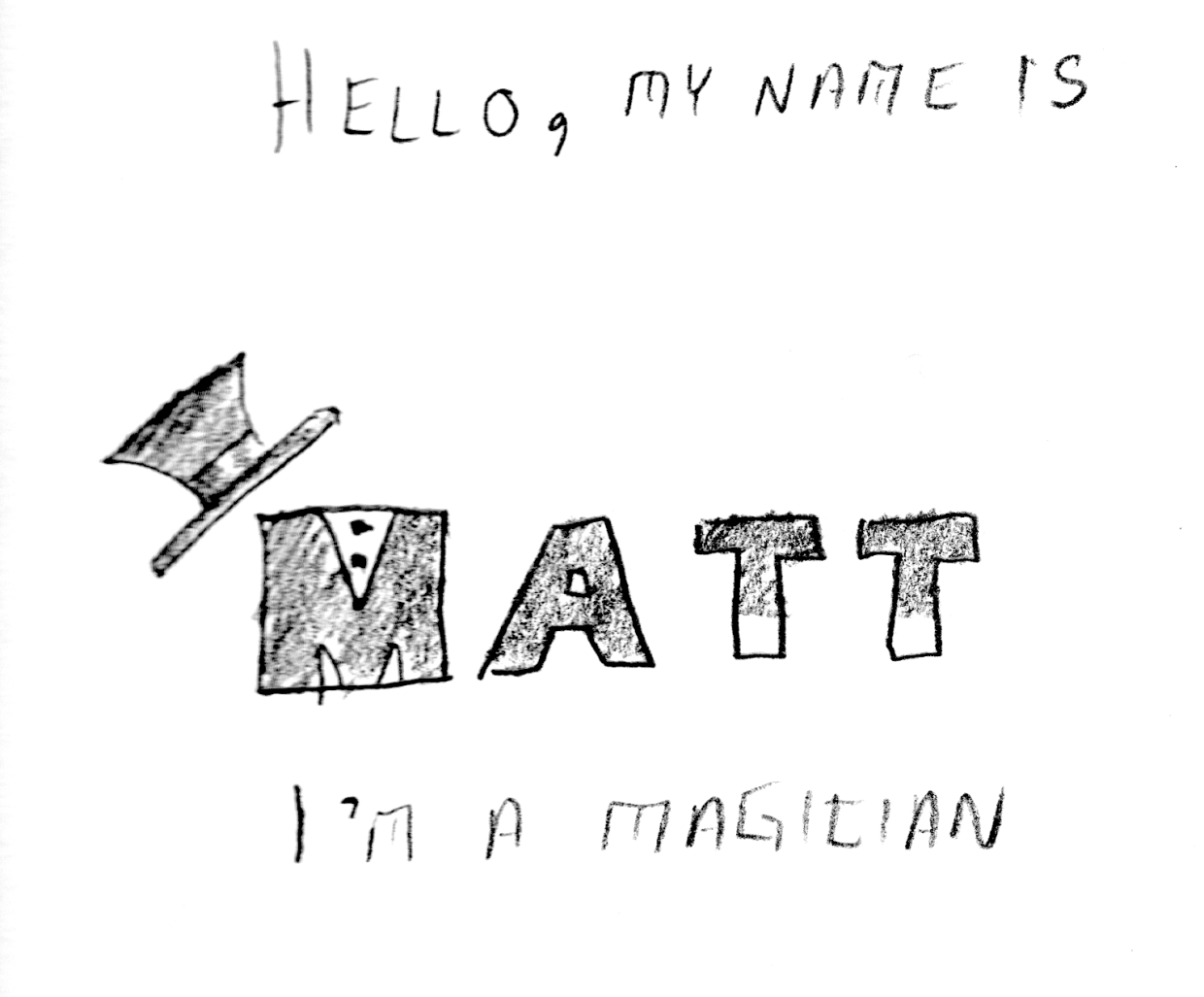
Our afternoon class schedule was oddly double booked with a class for MDes students. We got the right room number about five minutes before class was scheduled to begin. Like I said before: nothing is perfect. Jonathan Chapman is teaching our Design Thinking Seminar class. I think this class will be extremely valuable. He expects us to produce an impressive, complete, beautiful book (our own Design manual for non-designers) over a fifteen week period. The examples are intimidating, but I am mostly excited to think about what I will do - the work will be hard, but ultimately rewarding.
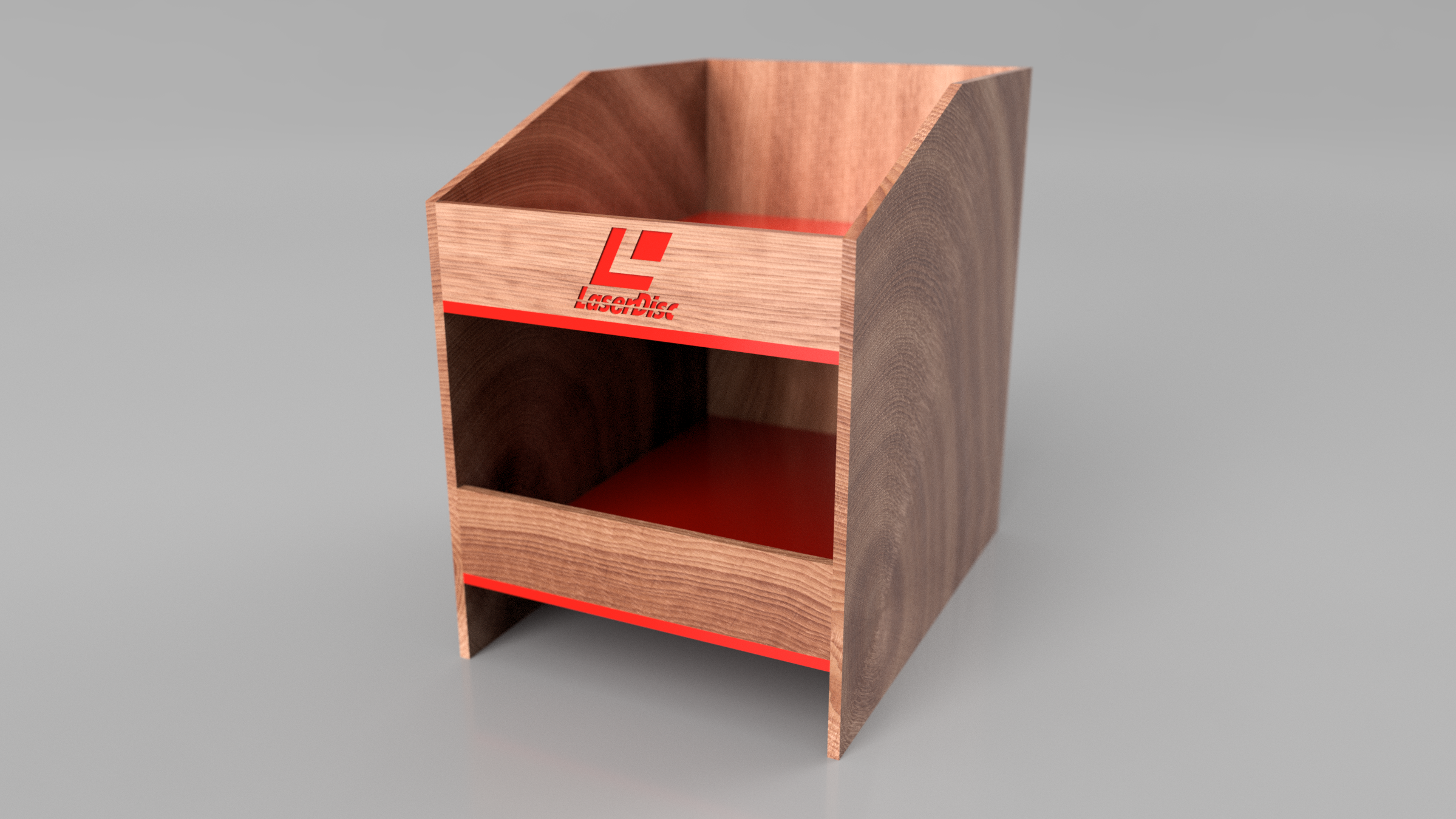
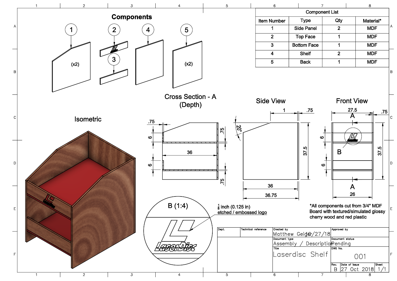
After class, Alex asked me about Laserdiscs and I told him that if he wanted to know the history, it would be an hour long conversation. I kept it to under twenty minutes - at least, I think I did.