A selection of photos taken at William Temple House 2018 “Lifting Spirits” annual fundraiser gala.
Read MorePHOTOSHOP CALISTHENICS
“1) Use the selection tools + refine edge to isolate objects from the Culture Catalogue image, then copy and paste them into a New Document, so that each is on a new layer. Rename the layers, save as: lastname-isolated-objects.psd”

Click here to download a copy.
“2) Use Retouch and Repair tools to modify radically alter the castle while maintaining a ‘realist’ aesthetic. Save as lastname-weird-castle.psd”

Click here to download a copy.
“3) Recombine objects from the Culture Catalogue within the Castle image, using refine-edge to integrate the objects more seamlessly. Save as lastname-weird-castle-2.psd”

PHOTOSHOP INTRODUCTION
Week 3 – Day 2
Photoshop tutorial
First, make sure you change three defaults:

Auto-select/Layers/Show Transform Controls
SELECTION TOOLS
Marquee//Lasso//Wand

Modify Selections by holding down SHIFT to add to a selection or Option to subtract from a selection.
Note: By default, when copy/pasting, it is added to a new layer
Checkerboard pattern indicates a transparent background

When selecting an object on a white background, you may get a white edge.
Use Refine Edge:
Option under selection tool.
Brush based retouch and repair tools
Healing Brush
Patch Tool
Content-Aware
I started with this image:

Source: Flickr User – “tickr”
I then decided it was time to “patch” this castle to its former glory…

I expanded the vertical dimensions by more than 400%, and then proceeded to “build” more layers of bricks, up into the sky. I used the lens distortion tools to create an illusion of perspective. Finally, I decided to add a “window” by cloning and inverting one of the smaller doors. Overall, I am pleased with how convincing this image is, but there are a few “bugs” in the picture (redundant, duplicate patterns) that detract from the overall realism. Still, I think I’ve done a better job than North Korea, and their use of Photoshop.
We miss you, Jon.

Source: The Guardian
PROJECT 1: FINAL PRODUCT
That’s all, folks!
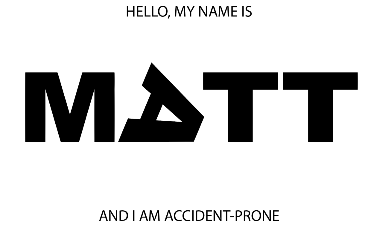
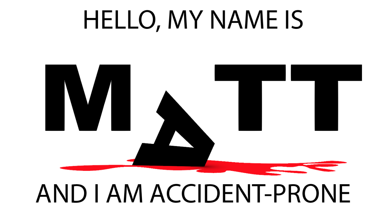
My final three images for the typographic portraits:

Even the letters in my name are "accident-prone."

This letter is serious business...pinky-swear!
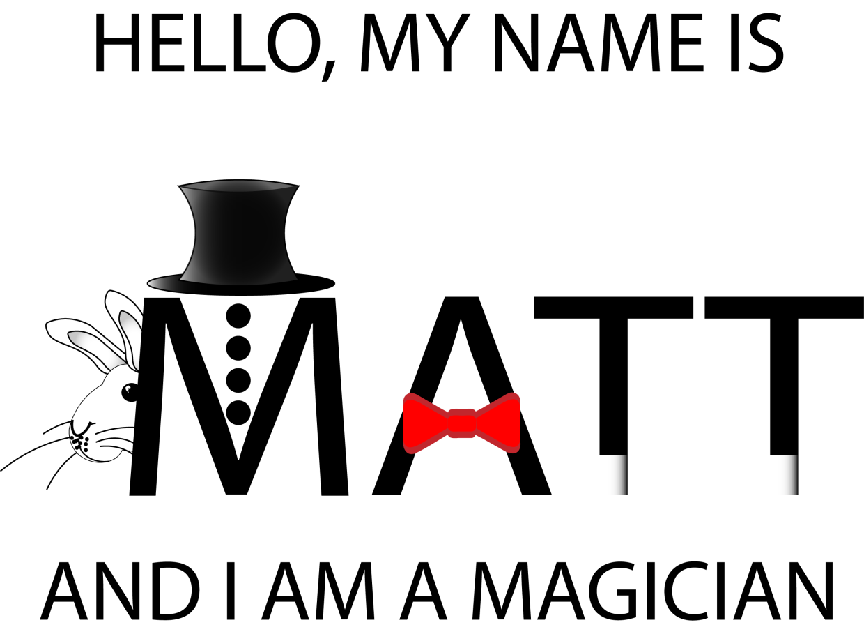
A good magician can make a rabbit disappear behind their name.
PROJECT-1: WEEKEND UPDATE
I’ve taken the criticisms into careful consideration, and here are the latest image updates:

I spent a lot of time figuring out how to use perspective to give the blood spatter a solid “floor,” but the letters felt too flat against that perspective surface. Carl had some input on this, and the end solution was to include a 3D Extrude stylization filter to give depth and dimension to the letter “A”. There is a nice contrast with the flat letters in the background, and a slightly more gray value is applied to the background letters to emphasize this.The blood was given more detail by using the Wrinkle Tool. Overall, this is a pleasing change and I’m much happier with the results than earlier versions.

hat kind of magician would I be without a rabbit? The peer critique included an earlier, rougher version of this critter, but I’ve refined it to a point where it is a welcome distraction and not just a proof of concept. The sparse grayscale image really Pops thanks to the included red bowtie. This was created as a series of shape (Rectangle Tool) and a thicker brush setting for the outline. A heavy use of Gradient was applied to multiple Layers of the top-hat to give it a more three-dimensional appearance. Abracadabra!

The lion’s share of time went into this third image. Carl had an interesting suggestion to give the background a crumpled paper appearance. I scoured the web for a few options on how to do this. One suggested using a gradient tool in Photoshop and importing that image into Illustrator like so:

This wasn’t a bad approach, but it didn’t really “look right” in Illustrator. The better solution I found came from a multistep approach involving actual crumpled paper (Read here). I started by crumpling a folded piece of paper, and then scanning a highDPI image of it and saving the PNG for use in Illustrator. I then used the Image Trace tool to assign shapes their corresponding values (4 shades of gray). The end effect was more convincing because it was derived from the genuine object. Next, I created improved letter “clippings” for the ransom note stylization by choosing a variety of fonts and color combinations, grouped with rectangles that were altered using Transform to give them a more natural appearance.
The final steps involved creating a severed finger – because just one pool of blood in a project is never enough. I started with the Rectangle tool and created two segments, for the third segment (the fingertip), I used a pair of Ellipse tool shapes (fingertip and fingernail), which I altered with the Pen Tool. I then used a gradient fill to give the nail some depth, but struggled to find a gradient to give the finger segments an illusion of depth. I decided to hold off on that detail and used a regular color fill from the Skin Tone Library (color swatch). I then rotated the segments to give the finger a more curled appearance, and the Pen Tool to create the creases in the skin.
Solution for creating depth: I layered four stacks of cloned finger (object groups) on top of one another and then used the Eraser to create a gradation of shadows (Stylization and Drop Shadow)to create a rounder appearance. The end effect is consistently cartoonish with the rest of the image.
Finally, I created a “blood soaked paper” effect by changing the fill color of the surrounding Image Trace generated shapes and the Wrinkle Tool to give it a more distressed appearance. The one effect I want but haven’t been able to figure out is how to “crinkle” the ransom note letters themselves. They feel a bit too flat, and out of place, but after a few failed attempts with the Knife Tool to create segments I’ve decided to error on the side of caution. If I come up with a solution by Monday, I’ll be sure to update the results here.
PROJECT 1 UPDATE
Minimal Realism:
” When I look at a wildlife or nature subject, I don’t see the feathers in the wings, I just count the wings. I see exciting shapes, color combinations, patterns, textures…”
Illustrator Demo
Type Text “CARL”
Object -> Make Outline
DON’T FORGET TO: Ungroup Text
Knife Tool -> Cut “waves” through the text.
Color the top half “Fill” Brown
Color the bottom half “Fill” Blue
Brush Pallet (icon looks like books on a shelf (i.e., library))
Using the brush tool change the outline of the letters to give a more “watery” look. Change stroke size to amplify effect.
Texture Pallet
Just like the brush library, you can fill an object with a variety of textures.
Command: Paste in place
This creates a copy of an object directly on top of the original; useful because you do not need to align the new object.
How to make triangles:
Use the Polygon tool, and then rightclick for a menu to select “sides”, change to: 3
Create object from center:
Hold down the option key
How to create “Distressing” shapes
Use the “Warp Tools”. The Icon looks somewhat like a tulip.
PNG Export: (For blog)
Use Artboard
300 DPI (High)
Background color: White
Critique Notes:
As of Wednesday evening this was the status of my three images:


My peers had some excellent suggestions.
Image one (accident-prone), is too flat. Consider moving the other letters of the text “back” into the image to create more depth
Image two (magician), needs more color. Black and white images are less interesting in this context, and more stylization of the letters would really help. Just as adding a gradient to the “wand tips” gave greater depth, consider adding more depth to this image as well.
Image three (hostage). This is an early start, and needs more work. Particularly, the texture on the letter “A” isn’t working well. The concept is interesting, but more details will make this a successful piece.
PROJECT 1: TYPOGRAPHIC PORTRAIT
The first day of the week and we’ve hit the ground running on this first project. It’s almost the end of class and I’m just now getting to the 2nd (of three) portraits. I asked for help on my first iteration, because it seemed like something was missing. I had followed the basic draft pretty closely, but it felt bare and uninteresting.

After talking with the professor, it was clear that I needed to express a greater range of tools. This was my second iteration:

Better, but not great. I added an organic shape and used the gradient tool to create a shadow effect. Still, the image felt a little too flat. One more tweak:
This simple vertical offset creates a bit more motion and surprise. I’m not sure what more I could add or subtract at this point. On to my second portrait…
In order to create a three-dimensional “floor” I used the perspective grid tool:

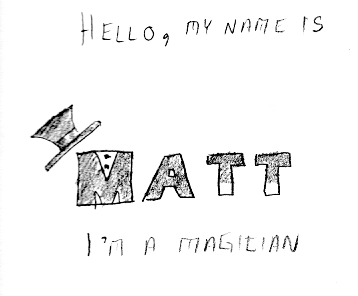

It isn’t really easy to see what I’m experimenting with just by looking at the image, but I have several elements that are grouped into logical objects. The “wand tips”are made using the rectangle Shape Tool, arranged above the Text and then individually grouped with their respective “T”s. Same for the “shirt buttons” on the “M”, as well as the top-hat. I’m not sure if this one would benefit from color or not. Perhaps I can use the gradient tool to give the “wand” more of a cylindrical appearance?
ADOBE ILLUSTRATOR READING RESPONSE – ART 119
Over the weekend I had a chance to sit down and read over the first two chapters of Adobe Illustrator guide. I think I may have just confused myself. One of the key challenges is the fact that I have very little experience with Adobe’s Creative Suite. It’s like a whole new language. Furthermore, I do not have this software at home, and thus cannot easily relate to these new sets of terms. It is hard to apply knowledge when everything about it is purely theoretical. Last but not least: this was just a ton of new information.
At least there were pictures.

Clear as mud, but at least you can see it. Page 33 (Artboard printing)
llustrator is a massive heap of skeuomorphisms, and this only makes sense for those who began their careers in print making prior to the advent of computers in Graphics Design. This can be a huge challenge for newcomers, but this challenge is hardly unique to Illustrator. True story: a seventeen-year-old in one of my freshmen courses once described the save button in MS Word as a “purple truck”.

Beep! Beep! I’m a truck!
See, the thing was, she’d never even seen a floppy disk before. This graphic held no contextual meaning for her. She never experienced the joy of inserting a 3.5-inch piece of plastic into a clunky (yet essential) device to save her document. By the time she was old enough for K-12, the iMac was standard, and those computers (controversially) never shipped with a floppy drive.

“No floppy, no problem! You’ve got the World-Wide Web, son!” source:betanews.com
she accepted the function (saving her document was important, after all), but couldn’t make the connection between function and form. I’m not telling this story because it is funny (I still laugh when I think about her), but because I can now relate to her better after reading about Adobe Illustrator’s Tool Bar and Control Panel. Some of the symbols are easy to recognize, despite the fact that I’ve never actually used them in real life:
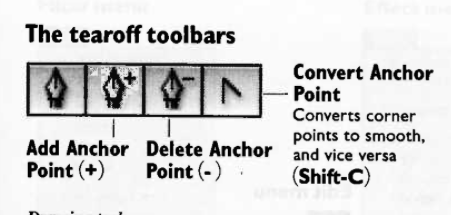
Page 3 – The tearoff toolbar
I’ve never used a fountain pen. I’ve had a classmate spatter ink on me accidentally with one, but that’s really about it. Generally speaking, I “get” pens. I’m fond of needlepoint over ballpoint, but that’s not the graphic here. What if I’d never seen a fountain pen before? How’d I ever hope to recognize the function?
I’m sure I’ll catch up, and with enough practice become proficient with this tool set. I just wonder how many “purple truck” moments I’ll have along the way.
INTRO TO ADOBE ILLUSTRATOR
Week 1 – Day 2
Introduction to Adobe Illustrator and Vector Graphics

Illustrator is part of Adobe’s Creative software suite (now “Creative Cloud”). The primary focus of Illustrator is the use of and creation of vector graphics. Most graphics are rasterized (a grid of pixels with assigned values); vectors are “drawn” by software (or hardware, if supported) and are not limited by resolution. At our university’s Mac lab, we have preloaded versions of Illustrator, here’s a quick run-through:
There are lots of ways to launch the program. My preferred method is to use Spotlight search.
Command+[Spacebar]
This will open a search box (this is like Google for your computer), just start typing “illustrator” and you’ll get an auto-complete before you finish typing it. Just hit Enter when it fills in the remaining characters. BAM! You’re in.
Next, we need to create a new project:

File -> New ->
Name: Lastname-Intro [Geiger-Intro ART119]
Profile: Web
Size: 960 x 560
Units: Pixels
Orientation: Landscape
After creating this new document, save it.
File -> Save ->
Save as: Lastname-Intro.ai [Geiger-Intro-ART119.ai]
Default settings -> OK
Terms:
Artboard
Working area
Shape Tool
Used to create a vector object
Vector object
Vector Objects are defined with Paths and Points
Stroke
Defines the thickness of lines (vectors)
Fill
Defines the “filling” of an object (like Twinkies)
Arrange
Illustrator “stacks” objects in the order they were created. To change this order, go to the top menu:
Object -> Arrange -> Send to…(back/front) Bring to (back/front)
Align
Like with a text editor, aligns an object to different orientations (objects, Artboard, etc.)
Keyboard Shortcuts:
Option+LeftClick(on object)+drag
Drag to new area to create a duplicate
LeftClick+drag(over objects)
Bounding box selects multiple items
Command+S
Save current progress
In-class exercise: practice drawing your name. I wrote mine in cyrillic:

The letter “а” is tricky, and I didn’t quite get it right on the first try (“Матвей Гайгер” The first “a” looks like an “o”). This was all done with the pen tool, but switching back and forth between the curve and straight pen.
Project 1: Typographic Portraits
Timeline:
Mar 30: Project Intro, sketch ideas for next class (blog)
Apr 05: Work time in class following demonstrations
Apr 07: Work Time in class, following demonstrations
Apr 11: Review Typographic Portraits
Example: “Eruption” “Tilt-A-Whirl” “Balloon Darts” “Roller Bowler” “Cock Clock” “Exit” “Copernicus”.
Choose 3 of 6 provided character prompts. Use your name, first and/or last or nickname. Along with typographic and design…
“Hello my name is______ and I’m…”
Due Monday:
Sketches and ideas for project
Reflection on Open House (Blog)
Reflection on reading (Adobe Illustrator (Blog))