PROJECT 1: TYPOGRAPHIC PORTRAIT

The first day of the week and we’ve hit the ground running on this first project. It’s almost the end of class and I’m just now getting to the 2nd (of three) portraits. I asked for help on my first iteration, because it seemed like something was missing. I had followed the basic draft pretty closely, but it felt bare and uninteresting.

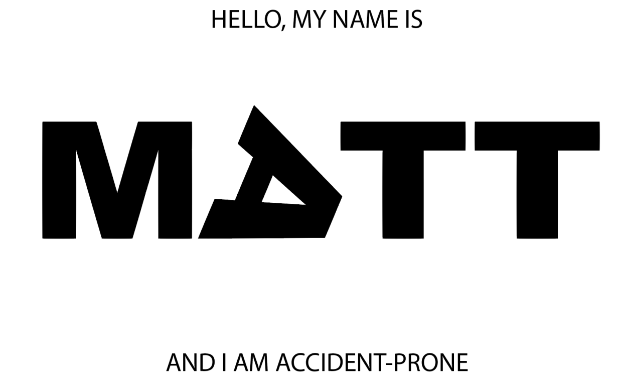
After talking with the professor, it was clear that I needed to express a greater range of tools. This was my second iteration:

Better, but not great. I added an organic shape and used the gradient tool to create a shadow effect. Still, the image felt a little too flat. One more tweak:

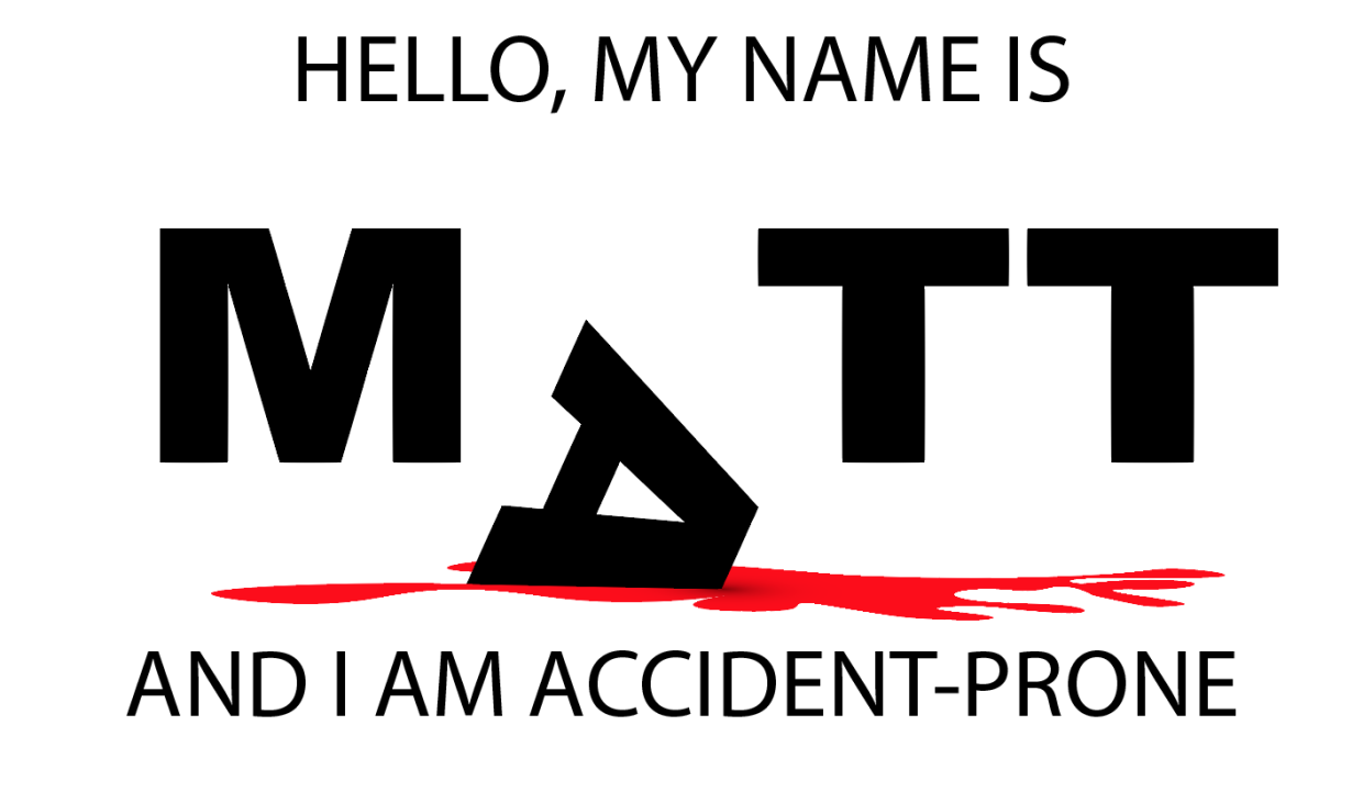
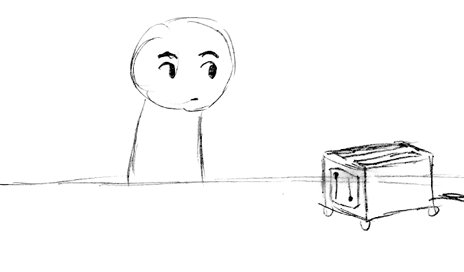
This simple vertical offset creates a bit more motion and surprise. I’m not sure what more I could add or subtract at this point. On to my second portrait…

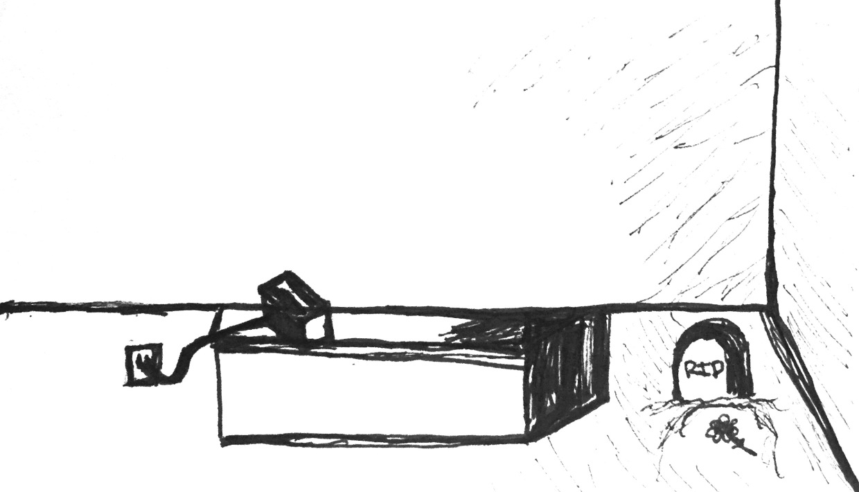
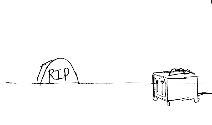
In order to create a three-dimensional “floor” I used the perspective grid tool:

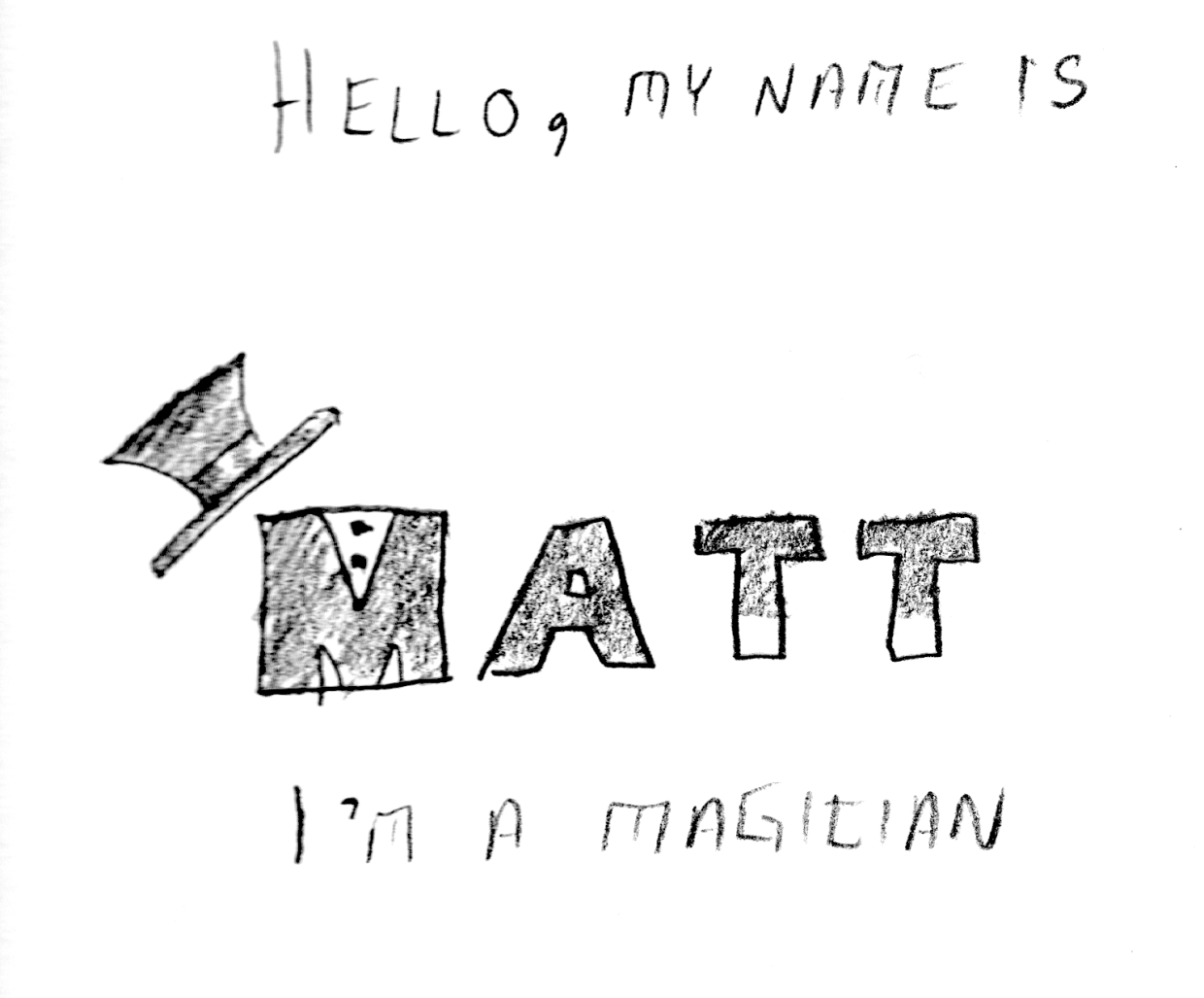
It isn’t really easy to see what I’m experimenting with just by looking at the image, but I have several elements that are grouped into logical objects. The “wand tips”are made using the rectangle Shape Tool, arranged above the Text and then individually grouped with their respective “T”s. Same for the “shirt buttons” on the “M”, as well as the top-hat. I’m not sure if this one would benefit from color or not. Perhaps I can use the gradient tool to give the “wand” more of a cylindrical appearance?

ADOBE ILLUSTRATOR READING RESPONSE – ART 119

Over the weekend I had a chance to sit down and read over the first two chapters of Adobe Illustrator guide. I think I may have just confused myself. One of the key challenges is the fact that I have very little experience with Adobe’s Creative Suite. It’s like a whole new language. Furthermore, I do not have this software at home, and thus cannot easily relate to these new sets of terms. It is hard to apply knowledge when everything about it is purely theoretical. Last but not least: this was just a ton of new information.

At least there were pictures.

Clear as mud, but at least you can see it. Page 33 (Artboard printing)

Clear as mud, but at least you can see it. Page 33 (Artboard printing)

llustrator is a massive heap of skeuomorphisms, and this only makes sense for those who began their careers in print making prior to the advent of computers in Graphics Design. This can be a huge challenge for newcomers, but this challenge is hardly unique to Illustrator. True story: a seventeen-year-old in one of my freshmen courses once described the save button in MS Word as a “purple truck”.

Beep! Beep! I’m a truck!

Beep! Beep! I’m a truck!

See, the thing was, she’d never even seen a floppy disk before. This graphic held no contextual meaning for her. She never experienced the joy of inserting a 3.5-inch piece of plastic into a clunky (yet essential) device to save her document. By the time she was old enough for K-12, the iMac was standard, and those computers (controversially) never shipped with a floppy drive.

“No floppy, no problem! You’ve got the World-Wide Web, son!” source:betanews.com

“No floppy, no problem! You’ve got the World-Wide Web, son!” source:betanews.com

she accepted the function (saving her document was important, after all), but couldn’t make the connection between function and form. I’m not telling this story because it is funny (I still laugh when I think about her), but because I can now relate to her better after reading about Adobe Illustrator’s Tool Bar and Control Panel. Some of the symbols are easy to recognize, despite the fact that I’ve never actually used them in real life:

Page 3 – The tearoff toolbar

Page 3 – The tearoff toolbar

I’ve never used a fountain pen. I’ve had a classmate spatter ink on me accidentally with one, but that’s really about it. Generally speaking, I “get” pens. I’m fond of needlepoint over ballpoint, but that’s not the graphic here. What if I’d never seen a fountain pen before? How’d I ever hope to recognize the function?

I’m sure I’ll catch up, and with enough practice become proficient with this tool set. I just wonder how many “purple truck” moments I’ll have along the way.


PROJECT 1: TYPOGRAPHIC PORTRAIT

Our first project in Digital Media / Time Design is a “Typographic Portrait.” What is a typographic portrait? It’s a combination of visual communication through stylization, combining graphical and textual elements. Here is the professor’s example:

Image by Carl Diehl, art119.wordpress.com

Image by Carl Diehl, art119.wordpress.com

As you can see from the above example, the name represents visual elements implying both “land” and “water”. The earth-tone brown is combined with wavy aquamarine/teal. Since amphibians are able to live both underwater and on dry land, this graphical representation is appropriate.

Our first step is to select from six options and perform a similar stylization on our own name:

Hello my name is Matt … I’m a magician

I’m accident-prone

I’m losing my temper

I’m visiting Portland

I’m afraid of the dark

Hello my name is _________ (fill in the blank)

Each image has some advantage. I tend to think that it is better to make work that is provocative than safe. The “ransom note” lettering is fun, but includes a dark humor component, the “magician” is playful but a bit on the nose, the “marksman” is very literal, but exists within the context of America’s gun violence epidemic (a controversial subject, to say the least), and the “Portland” is a bit more esoteric, and depends on a person’s familiarity with the sketch comedy of Portlandia‘s “Put a bird on it”. We’ll see what the professor has to say during today’s lab.

INTRO TO ADOBE ILLUSTRATOR

Week 1 – Day 2

Introduction to Adobe Illustrator and Vector Graphics

Illustrator is part of Adobe’s Creative software suite (now “Creative Cloud”). The primary focus of Illustrator is the use of and creation of vector graphics. Most graphics are rasterized (a grid of pixels with assigned values); vectors are “drawn” by software (or hardware, if supported) and are not limited by resolution. At our university’s Mac lab, we have preloaded versions of Illustrator, here’s a quick run-through:

There are lots of ways to launch the program. My preferred method is to use Spotlight search.

Command+[Spacebar]

This will open a search box (this is like Google for your computer), just start typing “illustrator” and you’ll get an auto-complete before you finish typing it. Just hit Enter when it fills in the remaining characters. BAM! You’re in.

Next, we need to create a new project:

File -> New ->

Name: Lastname-Intro [Geiger-Intro ART119]

Profile: Web

Size: 960 x 560

Units: Pixels

Orientation: Landscape

After creating this new document, save it.

File -> Save ->

Save as: Lastname-Intro.ai [Geiger-Intro-ART119.ai]

Default settings -> OK

Terms:

Artboard

Working area


Shape Tool

Used to create a vector object


Vector object

            Vector Objects are defined with Paths and Points


Stroke

            Defines the thickness of lines (vectors)


Fill

            Defines the “filling” of an object (like Twinkies)


Arrange

            Illustrator “stacks” objects in the order they were created. To change this order, go to the top menu:

Object -> Arrange -> Send to…(back/front) Bring to (back/front)

Align

            Like with a text editor, aligns an object to different orientations (objects, Artboard, etc.)


Keyboard Shortcuts:

Option+LeftClick(on object)+drag

            Drag to new area to create a duplicate

LeftClick+drag(over objects)

            Bounding box selects multiple items

Command+S

            Save current progress

In-class exercise: practice drawing your name. I wrote mine in cyrillic:

The letter “а” is tricky, and I didn’t quite get it right on the first try (“Матвей Гайгер” The first “a” looks like an “o”). This was all done with the pen tool, but switching back and forth between the curve and straight pen.

Project 1: Typographic Portraits

Timeline:

Mar 30: Project Intro, sketch ideas for next class (blog)

Apr 05: Work time in class following demonstrations

Apr 07: Work Time in class, following demonstrations

Apr 11: Review Typographic Portraits


Example: “Eruption” “Tilt-A-Whirl” “Balloon Darts” “Roller Bowler” “Cock Clock” “Exit” “Copernicus”.


Choose 3 of 6 provided character prompts. Use your name, first and/or last or nickname. Along with typographic and design…


“Hello my name is______ and I’m…”


Due Monday:

Sketches and ideas for project

Reflection on Open House (Blog)

Reflection on reading (Adobe Illustrator (Blog))


TIME DESIGN: ART119- SPRING 2016

Time Design relies on a few key elements: recurrence, subjectivity, intensity, and scope.

Scope: The range of actions or viewpoints within a given moment, and, conceptually, the range of ideas one’s mind can grasp.

his single-panel sketch compacts an efficient narrative: We see a toaster oven, still plugged in, and a grave site next to the counter where toast never materialized.

Subjectivity: Depicting a subject experiencing the passage of time through emotion, action, or movement.

In this three-panel sketch, we see Subjectivity at work, with intensification. The subject is seen waiting in the first pane, and then a stylization of toast as a clock signifies a passage of time (to reinforce/intensify the wristwatch from the first pane), and then in the final panel, we see a skull with attached cobwebs. This peak intensity, coupled with a toaster that still hasn’t produced toast, exaggerates the feeling of waiting – literally forever.

Intensity: Sequential exaggeration of particular attributes within a series of images.

n this final sequence, a four-panel sketch, we see a similar use of intensification. The subject ages, and dies. The toast materializes only after the subject has passed.

Why I am going carless

I sold my car today. I am going carless. Why am I doing this?

I live in Portland, and this city has some of the best public transit that I have ever seen -- inside the United States.

Most of the places I visit, I reach on foot.

I walk.

A lot.

Driving downtown is stressful. I am constantly on the lookout for bicyclists, inexperienced drivers, aggressive (assertive?) taxicabs, distracted animals, headphone-wearing zombies, etc. Even when I do reach my destination, it can be very difficult to find parking.

Insurance premiums stay the same from one month to the next, even if your car stays parked most of the time. That money could be spent on a taxi, train, or bus. Back when I was doing shift-work (12hrs.) it made a little more sense to have a commuter vehicle, but it's been almost a year since that was the case.

It was also about a year ago when something occurred to me: even if you use a car, that still counts as public transportation. Why? Because those roads are paved, and centrally planned. Unless you live in a state with lots of toll roads (Florida, comes to mind, and I'm sure there are others), chances are very good that your tax dollars went to paving and maintaining the roads that you are driving on. Throw in a few bridges and tunnels, and you are looking at a pretty large public investment in transportation.

Cars might make you feel like you are a rugged individual, blazing your own trail on that big, open road, but the simple fact of the matter is, comrade, that the roads you are driving on are more than likely owned by the public. So why have a private vehicle? Americans (myself included) love their cars. We love that "new car smell", and we love our cars as extensions of ourselves. They can be symbols of power, wealth, sexual prowess, environmental consciousness, nostalgia, ambition, or even a lack of one or all of those things. Cars don't just help us get from A to B, they help us express ourselves.

My car was more trouble than it was worth, but a small part of me will miss that artificially inflated sense of individuality, freedom, and independence. It was, after all, MY car, and I was free to do whatever I wanted with it, so long as I paid the price.

The last expense I had to pay was a $90 parking ticket. But that story deserves it's own entire post.

Some ideas are viral. If you're curious, you're infected.

I've been at this for a while. I've made my humble mark on Geocities, Anglefire, MySpace, LiveJournal, Friendster, Facebook, and Reddit, so why not a blog?

Here, you will find variety. This is not a place for a single subject.

I hope that some of my ideas will resonate with you. And maybe even grow into a community. For now, it is just me here with my ideas to share. Some ideas go viral, others remain dormant and buried. My hope is that if you are here, and reading these words, then you are already carrying a little bit of my voice with you. If you're curious, you're infected.