TUTORIAL: How to use ultra realistic Quixel Mixer materials with Fusion 360 [Part 2]

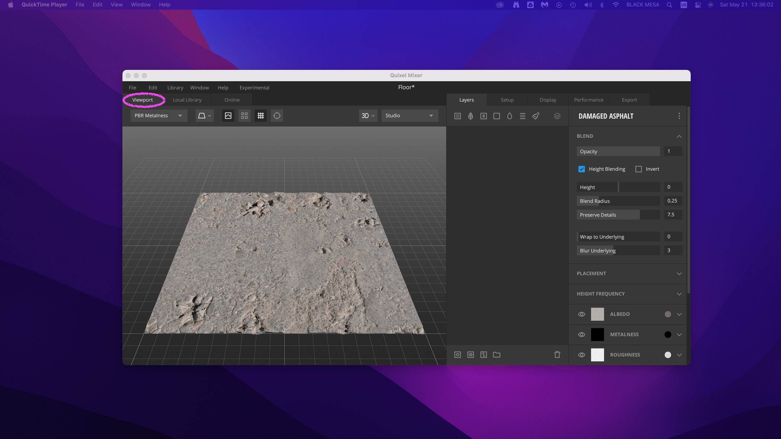
Welcome back! In Part 2, we’ll explore adding Quixel Materials to your designs in Fusion 360 and setting up a rendering scene. If you haven’t already, review Part 1 and install Quixel Mixer. You’ll want to create and export a mix for use in Fusion 360 prior to the steps in this tutorial, or download an example material set here.

First, let’s create a new project in Fusion 360:

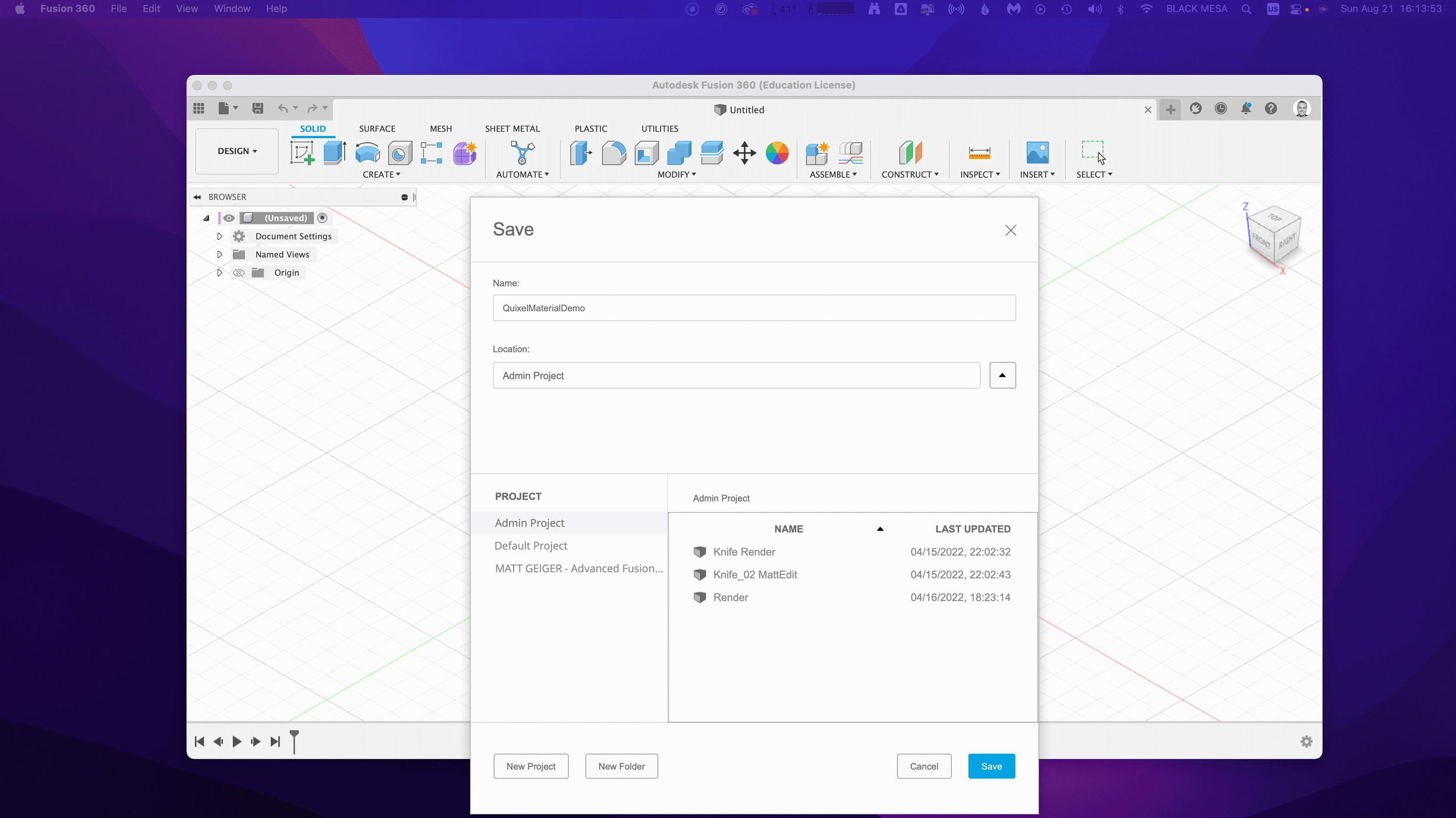
  1. Creating a new Fusion 360 Project

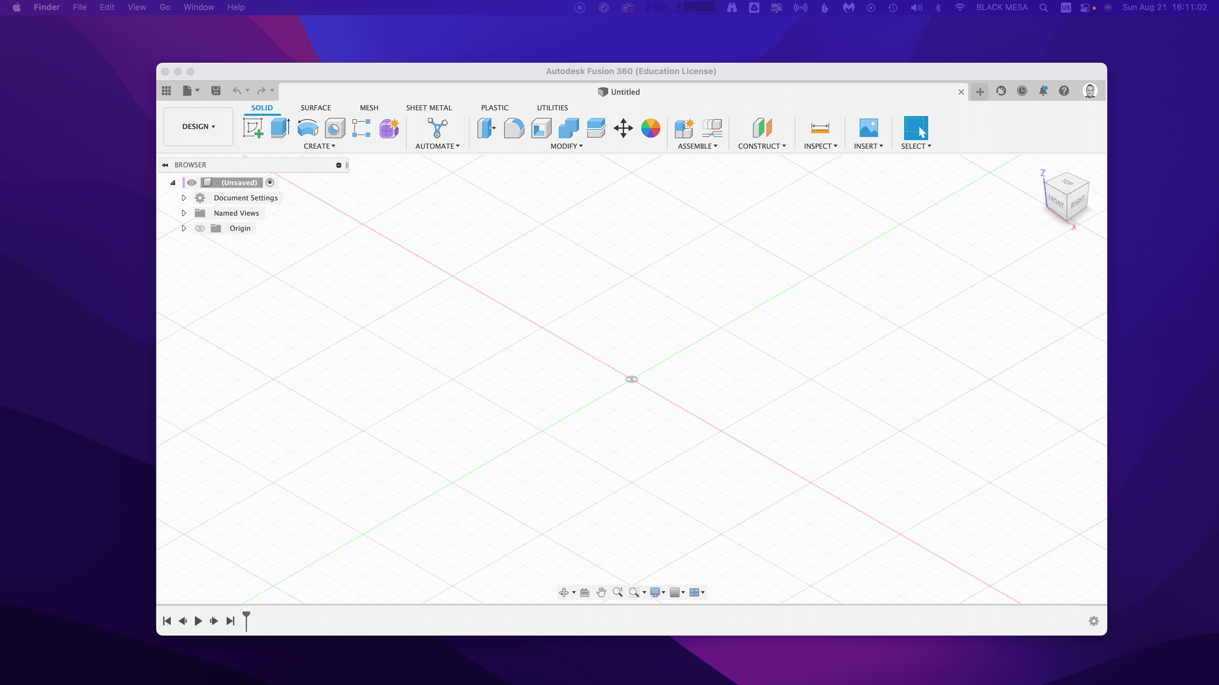
After you open Fusion 360, Click “Save” and give your project a name. In this example I used “QuixelMaterialDemo.”

After you save your project, we’ll want to create a new component and make it active.

2. Create a new Component

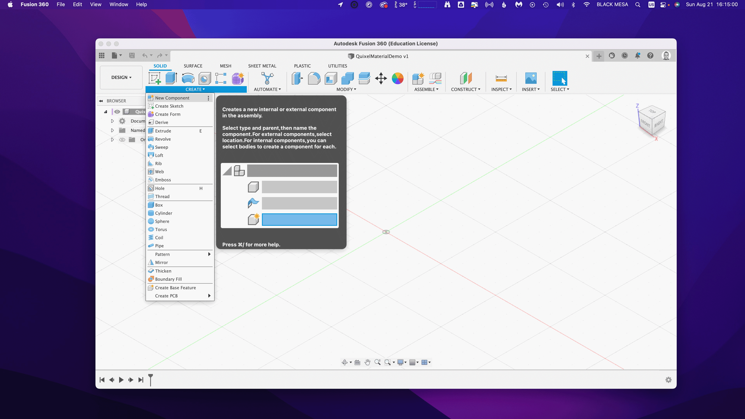
This is generally a good practice with Fusion 360, because we can more easily manage changes made to the design when the timeline is broken up by individual component histories. Name your component “Floor” and then make sure “Activate” is selected (should be by default), click “OK” to continue.

Next, we’ll want to create a sketch to define the floor’s dimensions. Click “Create” and make a Center Rectangle on the bottom plane.

3. Create a Floor

Make your sketch 3 meters x 3 meters in size, with the Origin at the center. Click “Finish Sketch” to continue. If you’ve done everything right, then you should have a sketch that is fully constrained (i.e., you’ll see black lines instead of blue lines for the outer dimensions of your sketch).

Next, we’ll extrude the sketch below the plain. This will create a new body, based on our sketch dimensions.

Click Create and then Extrude. Then, extrude the sketch -1mm below the plane and click “OK.”

Next, Save the design. You’ve created your first body and now would be a good time to save your progress.

Note the reason for your save and Click “OK.”

Next, we’ll want to change the Appearance of our floor. Click Modify Appearance to bring up the Appearance Window.

4. Add material

Here we can see the default material for the Floor body. We’ll want to replace that material with our Quixel Mix. To do that, let’s start by downloading a similar material.

Note: in general, you’ll find it is easier to add Quixel Mixer materials when you adapt an existing material in Fusion 360 with similar attributes. In this case, we can use the existing Asphalt Material.

After the download finishes, click and drag the Asphalt material into your design.

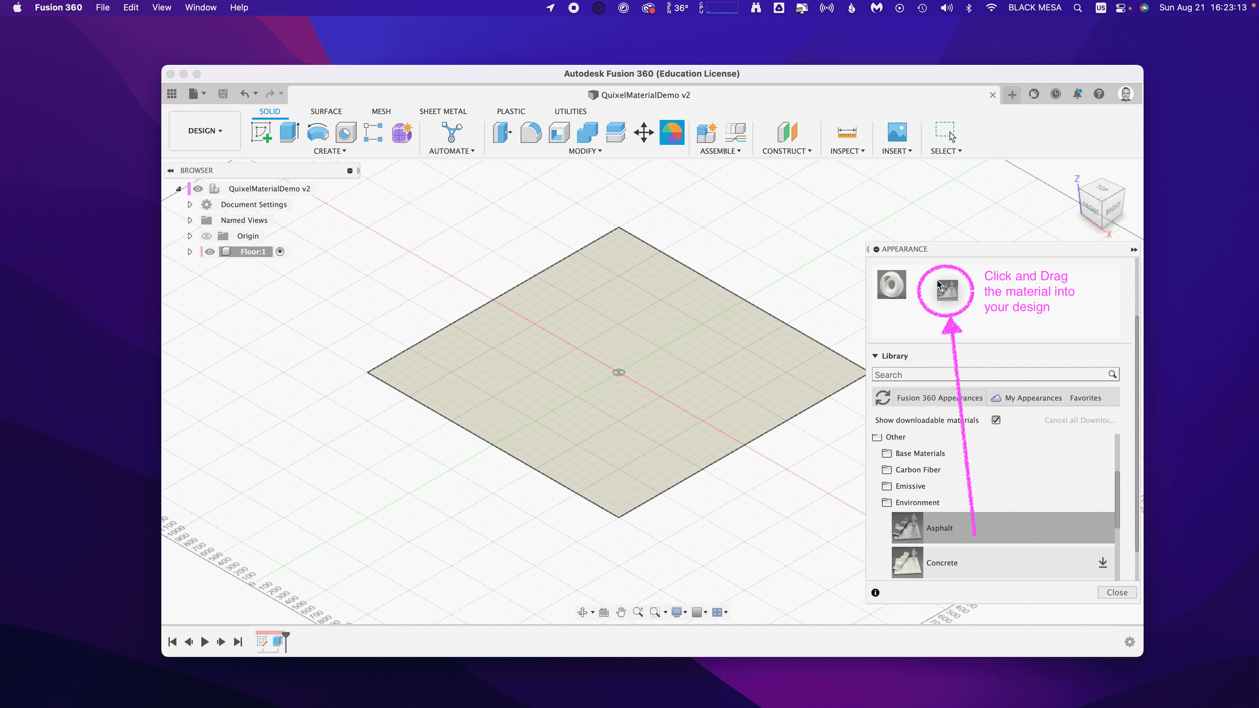
We can then replace the default material with the Asphalt.

5. Replace Fusion 360 Material with Quixel Mix

Next, we can begin modifying the Fusion 360 Asphalt material with the Quixel Mix.

As mentioned in Part I, the materials in Fusion 360 are made up of individual map image files:

Albedo/Diffusion/Color — the color a material reflects

Normal and/or Height Maps — the bumps and imperfections along a surface

Roughness — the smoothness of a surface (ranging from a sharp reflection to fuzzy/diffuse)

Reflectance/Specular/Metalness — the reflectiveness of a surface (ranging from mirror finish to a dull surface)

Anisotropy/Ambient Occlusion — the shadows along a surface

Refractive —how light bends through a surface

Emissive — how much light a surface emits (glow)

Translucency/Opacity — how transparent a surface is to light

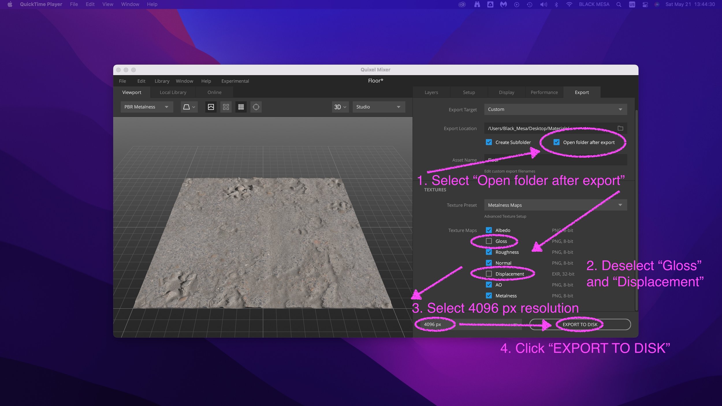
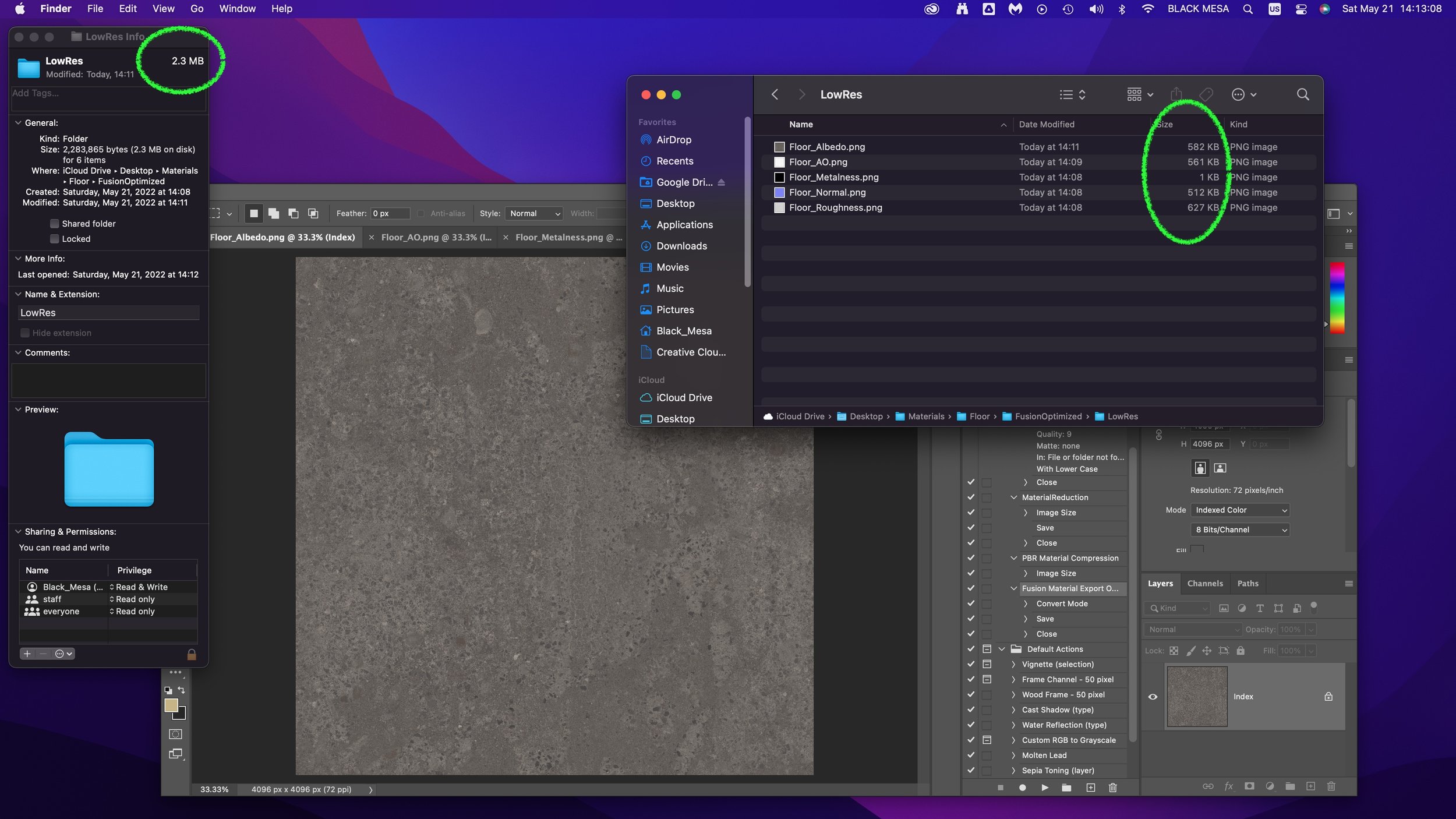
If you’re using the included sample images, you’ll find some but not all of these maps. Depending on what materials you’re mixing, you’ll need different image maps. The sample image package includes:

Floor_Diffuse.png — Color (placed in Parameters)

Floor_Roughness.png — Roughness (placed in Parameters)

Floor_Specular.png — Reflectance (placed in Parameters)

Floor_Normal.png — Normal (placed in Relief Pattern (Bump))

Floor_AO.png — Anisotropy (placed in Advanced Highlight Controls)

By replacing and adding these map files to the Fusion 360 Asphalt material, you can transform it to the Quixel mix. To start this replacement process, open the Appearance window, double-click the Asphalt material and then click “Advanced…”

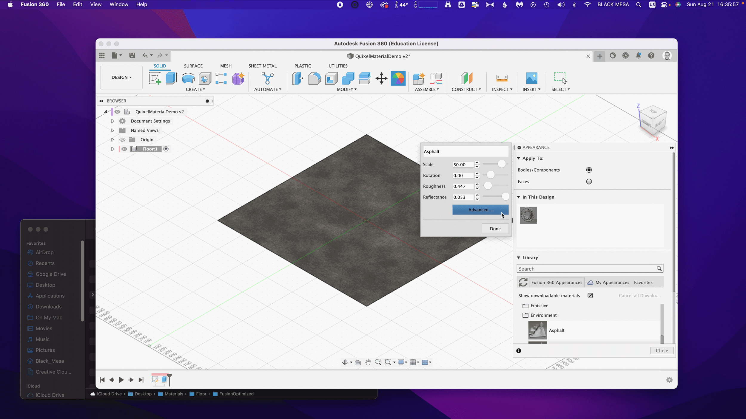
Rename the material to “Quixel_Asphalt” to distinguish the material from the original Fusion 360 Asphalt.

Under Parameters, we can add three (3) image maps. First, we’ll apply the diffusion/color map to the Image input in Fusion 360. Click on the Image filename 1_mats_surface_asphalt_color.jpg and navigate to your replacement images.

Select your Albedo/Color/Diffuse map file. If you’re using the sample images, it’s the file named Floor_Diffuse.png. Click Open to replace the default image file.

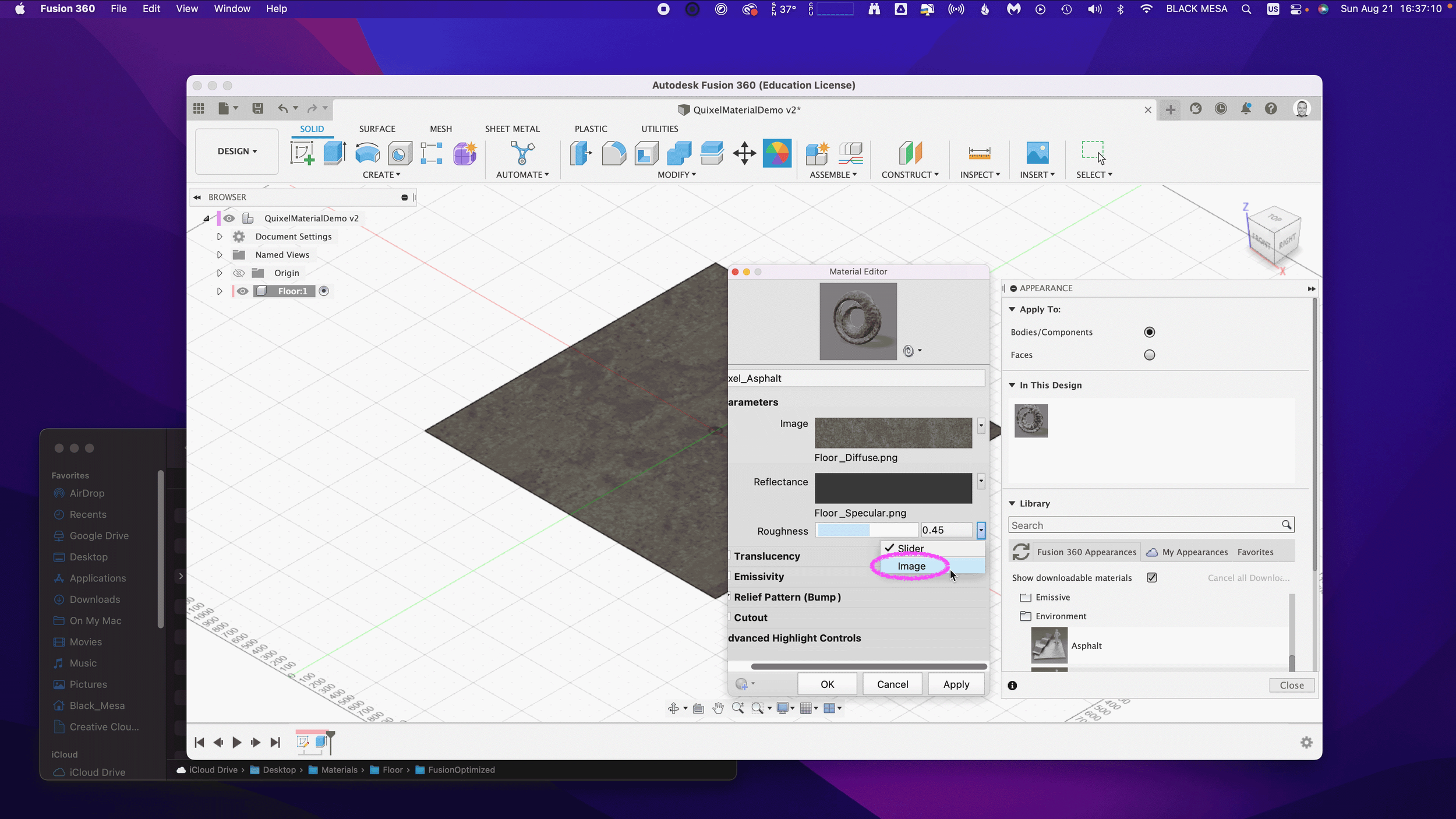
Next, we’ll repeat the process with the Reflectance and Roughness maps. By default, these two material attributes are set as Slider values, click the drop down arrow and then select Image to replace the slider value with an image map.

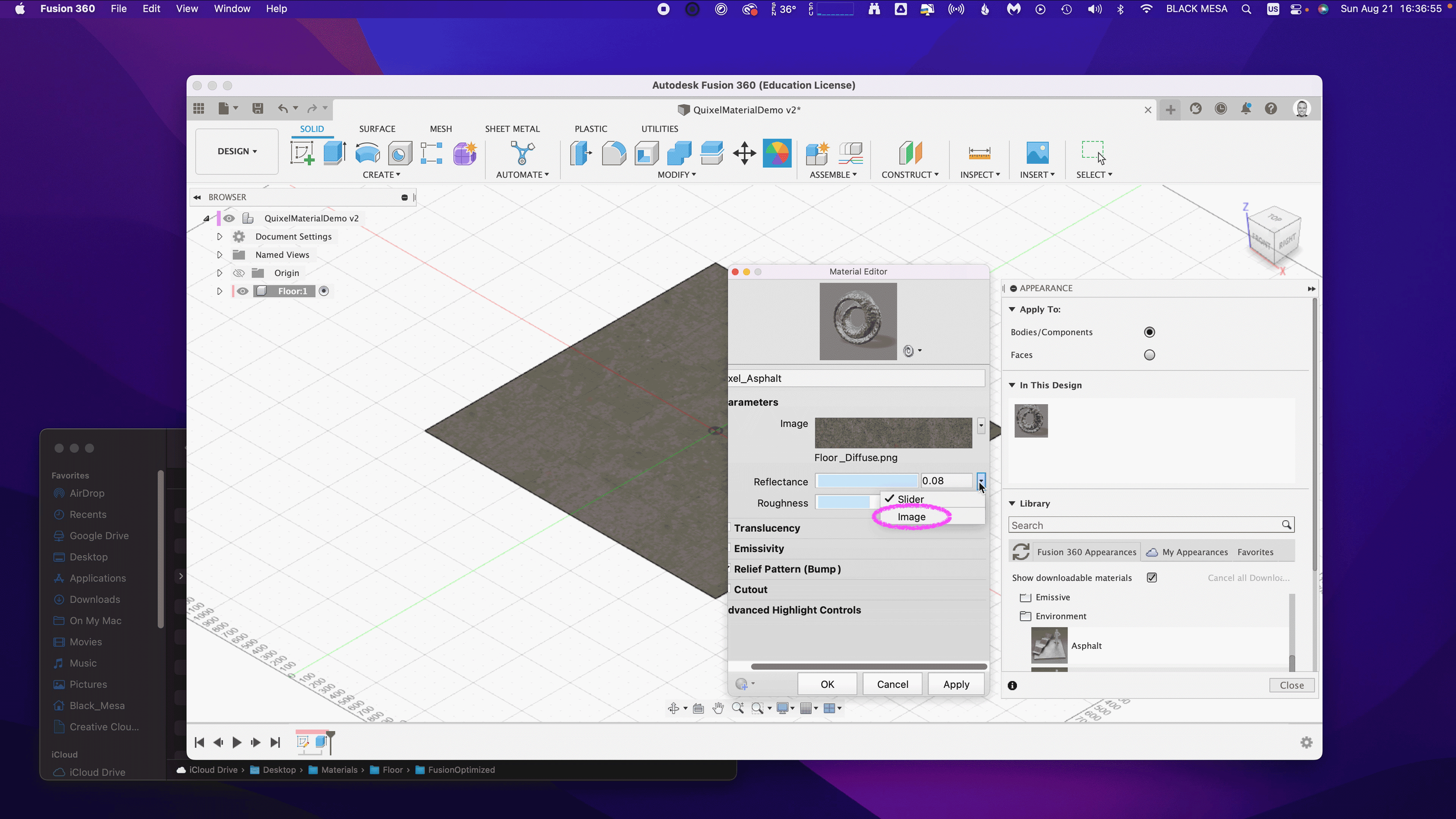
Next, select the Metallic/Specular image map if you’re using the sample images, select Floor_Specular.png and click Open.

Next, repeat the same steps for the Roughness value. Select Image and then select your Roughness Map. If you’re using the sample images, select the Floor_Roughness.png.

Now that we’ve completed the three Parameter maps, we can move on to the Relief Pattern (Bump) map. Once again, we’ll replace the default image file (1_mats_surface_asphalt_.jpg) associated with the material. Note: Fusion 360 supports both bump and normal maps. If you want to know more about these two approaches to texturing a 3D model, then click here.

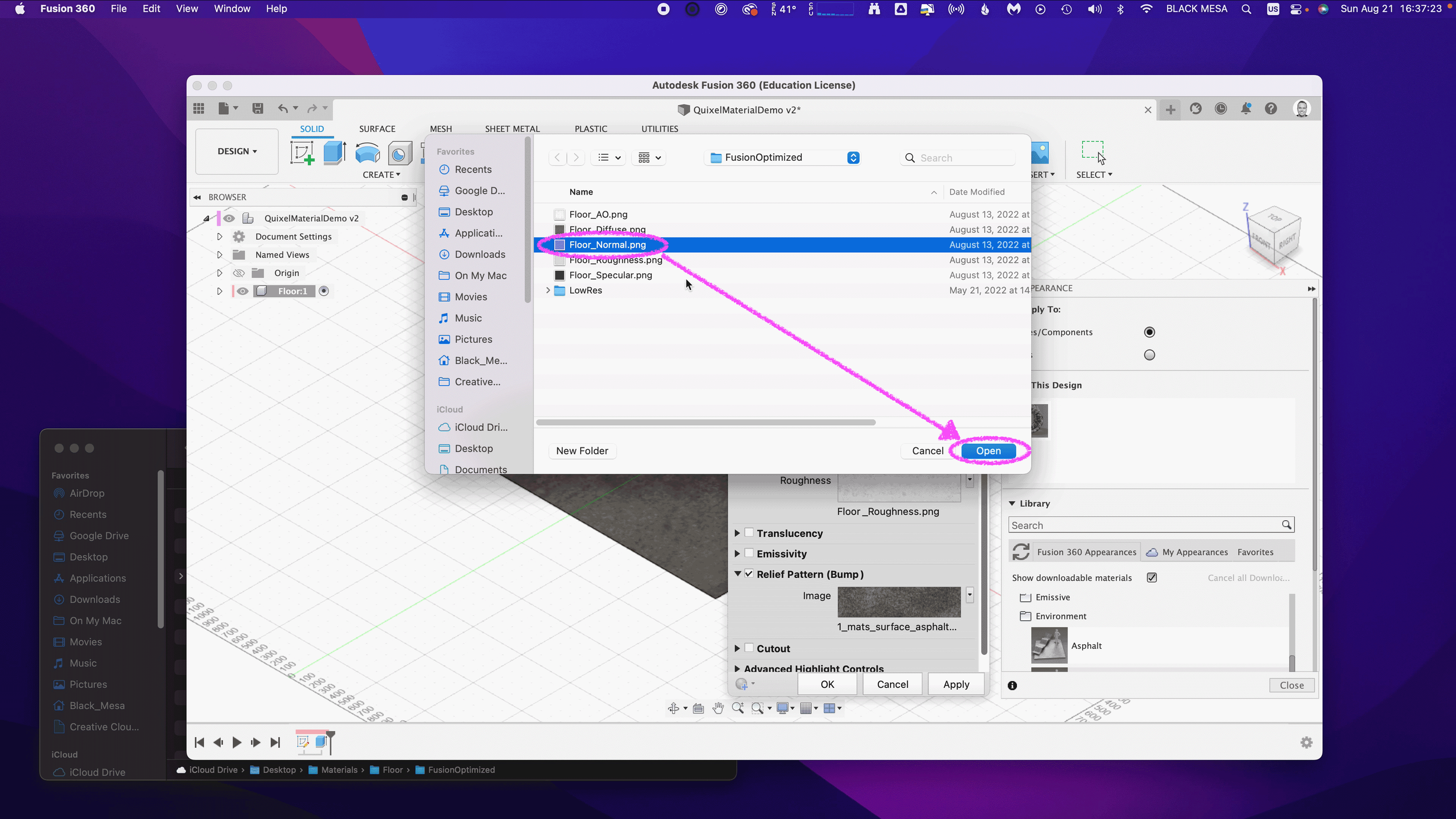
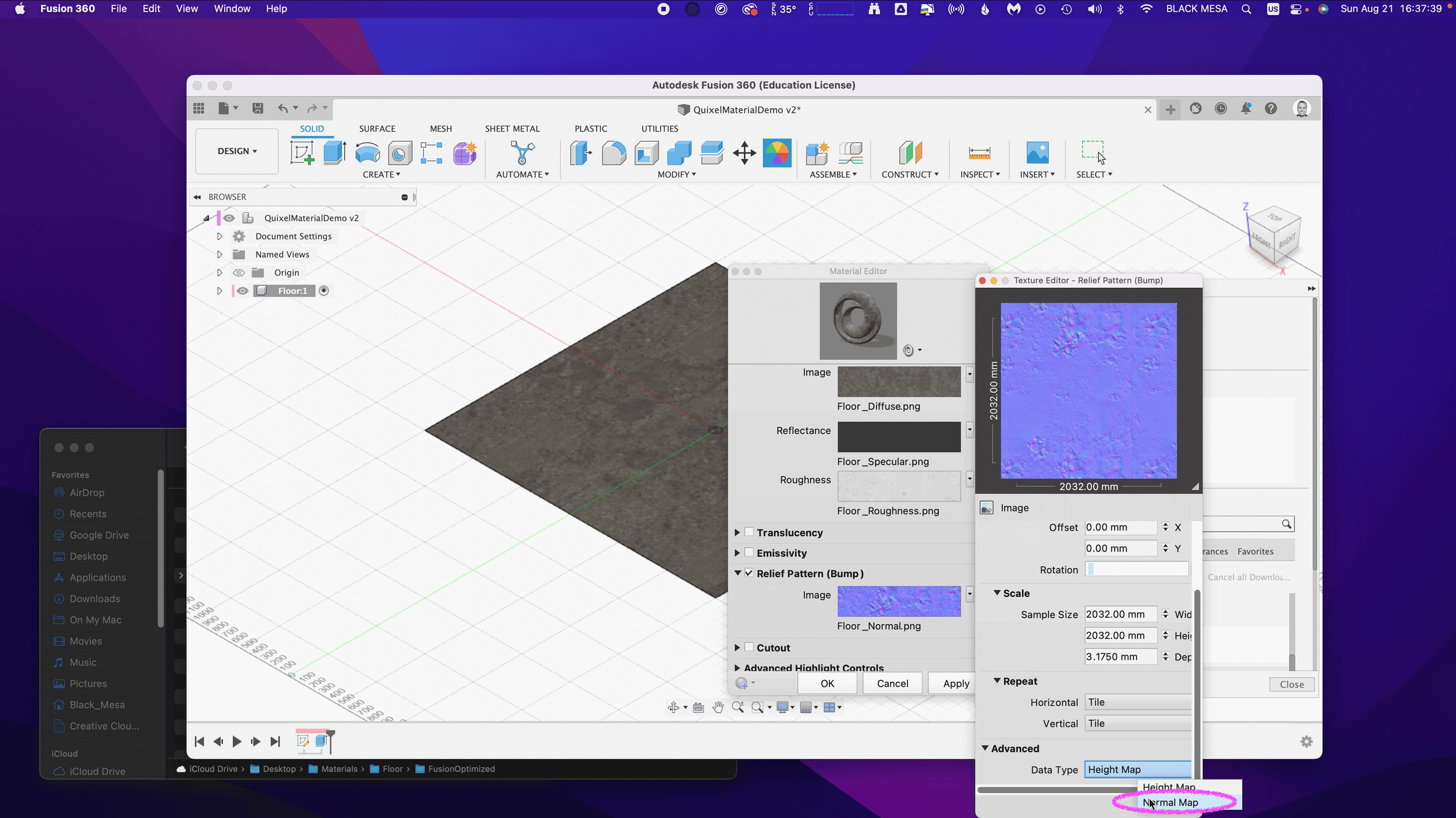
Next, we need to change the Relief Pattern from a Height Map to a Normal Map. To do this, we need to Edit the image.

Next, scroll down to Advanced and change Data Type to Normal Map.

Next, we need to ensure that all of our maps are using the same Sample Size. Be sure to repeat this step for all image maps. We also need to ensure that all of our Maps have Linked texture transforms. Check the Link texture transforms under the Transforms section of the Texture Editor. Be sure to repeat this step for all image maps.

These steps are important, because they ensure that all of the image map data are aligned equally to the material in Fusion 360. After you’ve verified these settings, you can click “OK” to finalize the changes to this material.

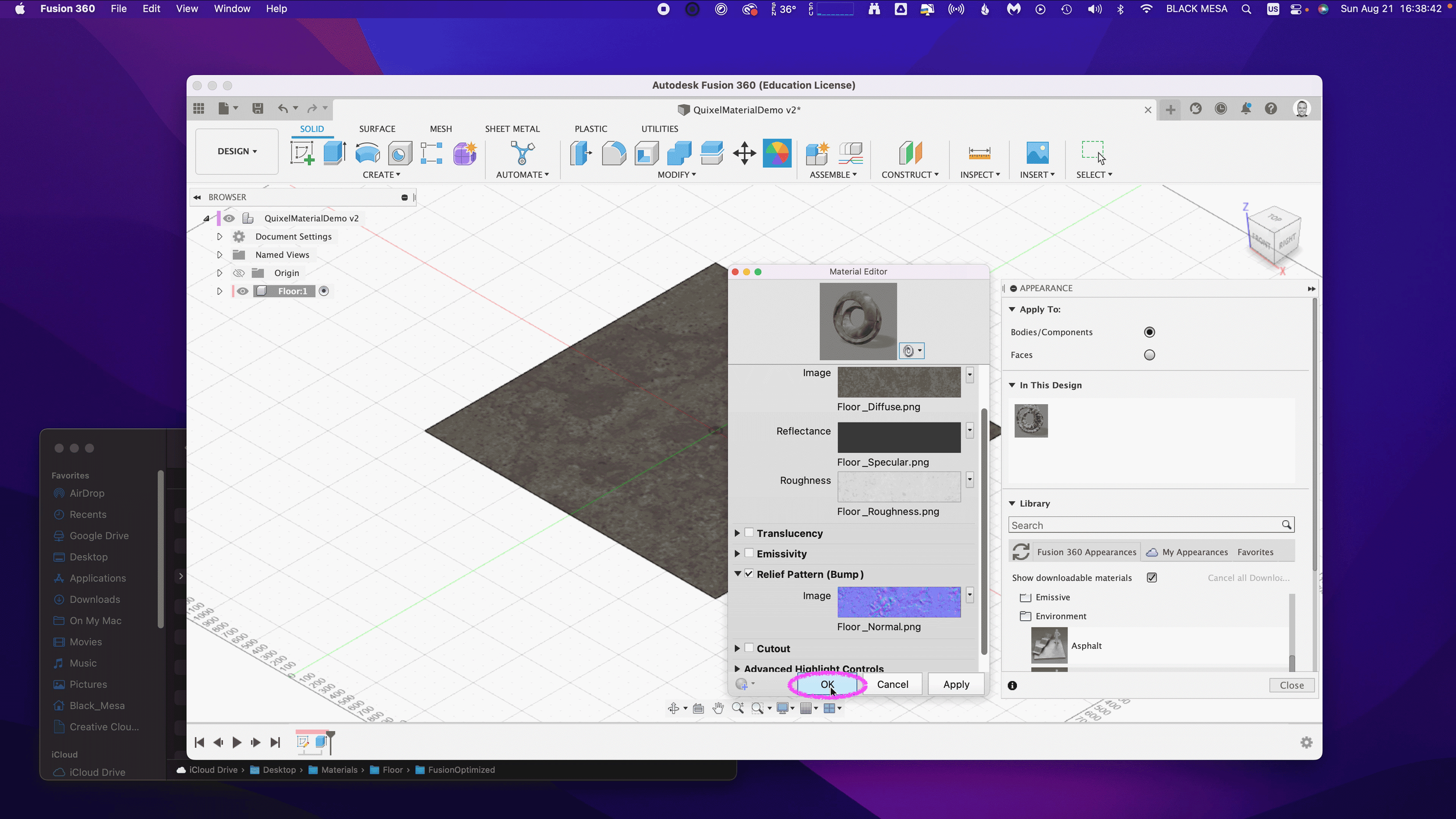
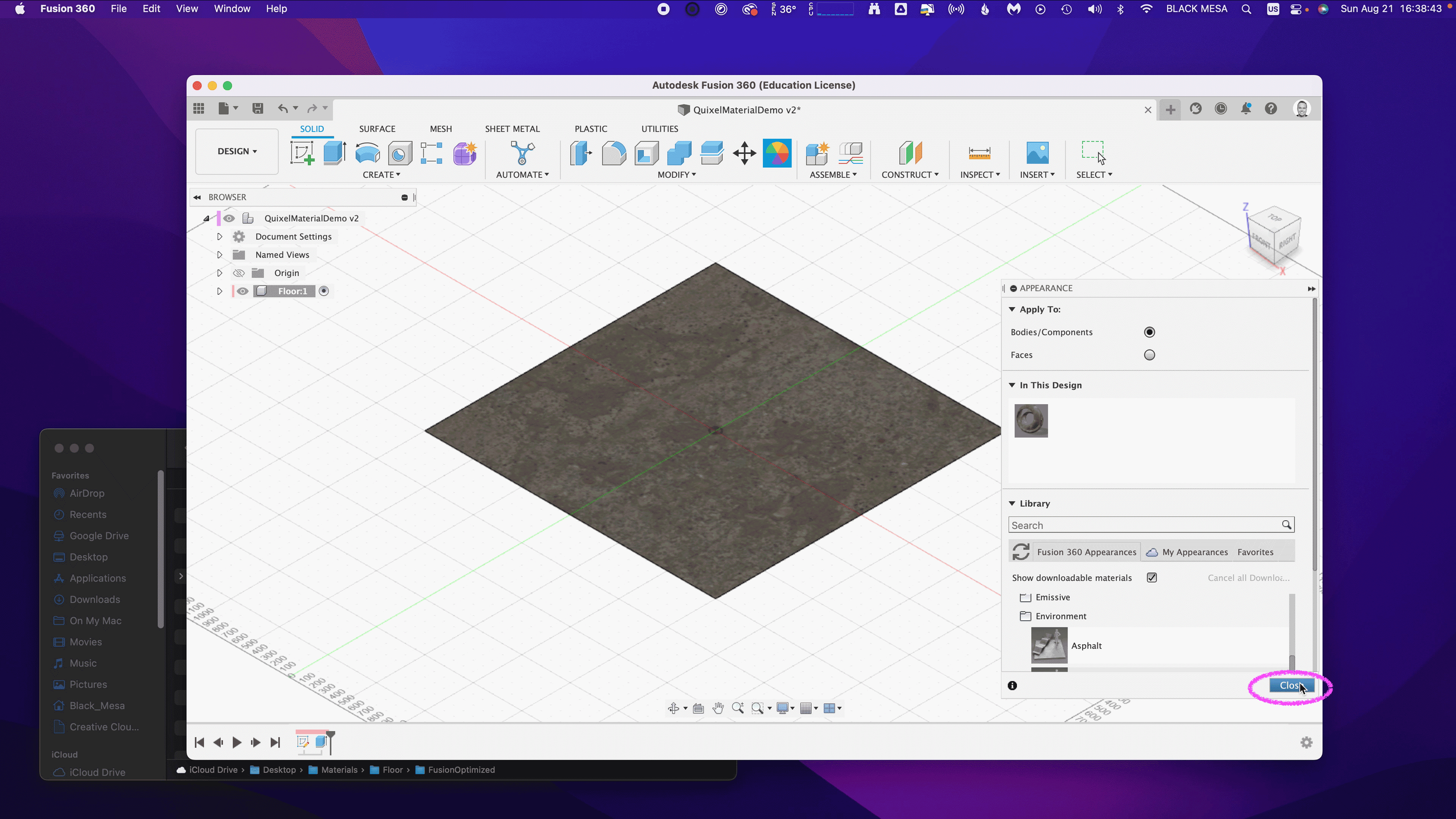
Now that the material has been updated you can Close the Appearances window.

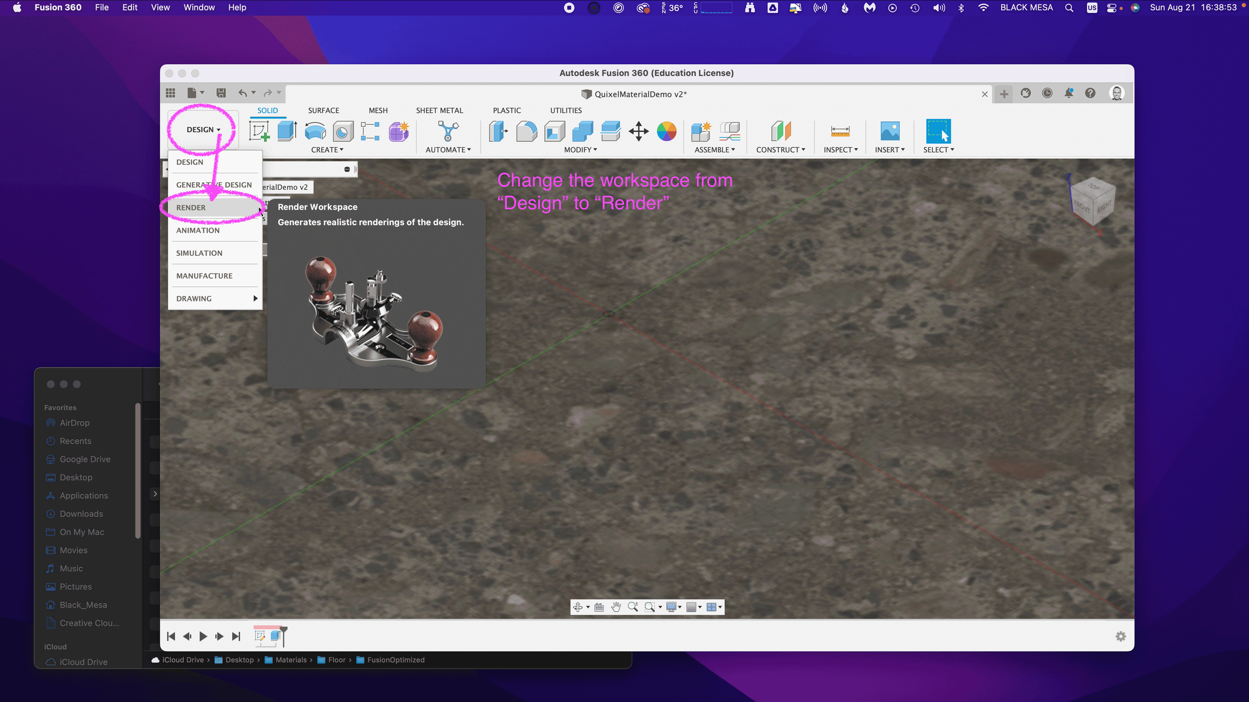
To check and validate our new material, we need to switch to the Render Workspace in Fusion 360. Click on the Workspace button, and change it from DESIGN to RENDER.

6. Test render scene

Next, let’s save the design to capture the new material settings in your Fusion 360 Timeline. Click File and Save.

Fusion 360 will prompt you to describe your save point. Let’s name this save “Quixel Material Added” and click OK.

Before we can test our new material, we need to edit the SCENE SETTINGS from the SETUP Menu. Open the SCENE SETTING Window and Click+Drag “Dry lake bed” to the Current Environment and then Click Close.

We also need to change the IN-CANVAS RENDER settings to FAST, so that we can easily see the material’s performance during rendering. To do this, click on the IN-CANVAS RENDER SETTINGS icon and Click on the Fast tab. Then, Click OK to update the rendering method.

Next, we can preview the rendering, and see how the various maps work together under different lighting conditions. To do this, start the In-Canvas Rendering and then open Scene Settings, click on the Position Icon to bring up the Rotation and Scale Sliders. By changing the rotation, you can see how the surface of your floor object casts shadows at different angles, corresponding to the surface material.

Make sure to save your project to retain your rendering settings. If you’ve made it this far, then congratulations! You now have all of the information necessary to import Quixel Mixer materials in Fusion 360. In Part 3, we’ll explore some techniques for applying these materials to complex geometries, and how to post-process your images for additional realness. In Part 4, we’ll take these realistic models and generate Augmented Reality experiences for iOS.

Stay tuned!

Core77 Design Awards 2022

I’m very pleased to see Stuart Candy’s project “Imagination is a Commons” is the winner for Core77’s award for Speculative Design, 2022. Back in March of 2021, I received a somewhat unusual paid request — for studio photography services. One year into the COVID-19 pandemic, when vaccines were still out of reach for many, and facilities and institutions remained shuttered, I was suffering from cabin fever isolation and grieving the death of my uncle.

I was finishing up my second Master’s degree, and Pittsburgh had only begun to thaw after a long and difficult winter. Without access to the campus photography studio, Stuart had reached out to his network at Carnegie Mellon, seeking alternatives. As luck would have it, during my undergraduate studies I invested in my own studio photography setup.

My barebones digital photography setup

Scrappy resilience was a constant theme throughout 2020. Students without studio space were constantly finding ways to make do. This was one of those rare moments where few compromises were necessary, and I had everything I needed on hand. Imagine my surprise when I was handed a bag full of artifacts from the future…

T-shirts from a coding festival in the year 2030

Social distancing and staying home (for the better part of a year) had distorted my sense of time. In the first year of the pandemic, there were days and weeks that seemed to vaporize, and weekends that lasted a month. To hold these artifacts, and to focus on them through a viewfinder, I felt as though I had stepped completely outside of time and space. This was a perfect diversion from my mundane existence, and a reminder that this too shall pass.

Thank you, Stuart and Ceda. And congratulations!

Week 2: Summer Internship

This week I continued working on 3D asset creation. My basic approach so far has been to start with a simplified geometry from Fusion 360, then export that design as an .FBX (Autodesk Maya file format), import the FBX to Blender for UV mapping, material, and motion rigging. There’s probably a more streamline way to generate this content, but from a feasibility standpoint, this approach allows me to be flexible and to use different tools for discrete tasks. This week I will be importing these combined assets into Unreal Engine.

This week was also my final week for the term at PCC, where I have enrolled in their online course for Advanced Fusion 360. I’ve been working on a group project, and designing assemblies for use in a solar projector system. The design is based on COTS (commercial off-the-self parts), which required me to draft profiles to meet engineering specifications.

Picatinny rail specification downloaded from wiki-commons.

Picatinny rail specification downloaded from wiki-commons.

The final deliverables are due this coming Saturday, and there is still a good bit of work to be done before we get graded on this project. Nevertheless, I am very pleased with the current state of things. I’ve been using Quixel Mixer to produce more realistic rendering material than the library included with Fusion 360. I say, “more” realistic because Fusion 360 already has some excellent materials. Take a look at this rendering of a Bushnell 10x42 monocle (one of the components in this project):

Bushnell Legend 10x42 Ultra HD Tactical Monocular Black rendering v14.png

I haven’t yet added any details, but as you can see, the rubberized exterior and textured plastic hardware are fairly convincing. Now, take a look at the mounting hardware rendered with Quixel textures:

Picatinny rail bracket rendering v7.png

An important component in photorealism is the inclusion of flaws. Real life objects are never perfectly clean, perfectly smooth, or with perfect edges. Surface defects, dirt, scratches, and optical effects play an important role in tricking the eye into believing a rendering. With Quixel Mixer, it is possible to quickly generate customized materials. While this product is intended for use with Unreal Engine and other real-time applications, it does an amazing job when coupled with a physical based renderer.

Picatinny rail set with hardware and bracket.

Picatinny rail set with hardware and bracket.

I’m excited to see what can be done with these materials in a real-time engine, especially given the advanced features of Unreal Engine 5. Fusion 360’s rendering is CPU driven, whereas Unreal is GPU accelerated. With both Nvidia and AMD now selling GPUs with built-in raytracing support, it won’t be long before we see applications that offer simultaneous photorealism rendering within modeling workflows.

Additionally, GPUs also work extremely well as massively parallel computing units, ideal for physical simulations. This opens up all kinds of possibilities for real-time simulated stress testing and destructive testing. It wasn’t that long ago that that ASCI Red was the pinnacle of physical simulation via supercomputer. Today, comparable systems can be purchased for less than $2,000.

Of course, this price assumes you can buy the hardware retail. The current chip shortage has inflated prices more than 200% above MSRP. Fortunately, with crypto markets in decline and businesses reopening as vaccination rates exceed 50% in some regions, there are rays of hope for raytracing-capable hardware being in hand soon.

Week 15: Final Project Update

This will be my final update for the Studio II project. I feel a complex blend of emotions as I write this. I am relieved to be done. I am also sad to know that my time with this team has come to an end. I consider myself incredibly lucky to have spent so much time working with some truly amazing designers. I don’t know if I will ever experience anything like this again, but I hope so.

Remote collaboration has few perks, and I was lucky to be working with folks who helped to make this experience so much fun

Remote collaboration has few perks, and I was lucky to be working with folks who helped to make this experience so much fun

The work we have done this week feels different for many reasons. We had to prepare something for a large and diverse audience, not all of which knew or were familiar with the context of our work. Additionally, we also needed to use this time to tie up remaining loose ends—we needed to reach an end state where our process could feel somewhat conclusive.

Our efforts were just as collaborative as ever, as we divided up the labor of our remaining tasks. I was incredibly reassuring to know my team members strengths and capabilities. Knowing who was working on a particular task was reassuring. For my part, I was busy scrubbing through a timeline in After Effects, rapidly assembling visual representations and edited footage to make a convincing newscast from the future. Considering the constraints of remote collaboration, I’m very pleased with the final product.

I have continued to ruminate about over this notion that the future is something we cannot predict, but rather something we build through imperfect knowledge. I question the power our team has to influence this process, not because I lack the confidence in our shared abilities —as I said earlier and often, I’ve been working with an amazing team— but more of a concern around consequences of inspiration. Our process was far from perfect. The vagaries of a pandemic distorted every effort. The educators we sought to connect with were terribly busy. Our own team suffered from fatigue and sleeplessness as we juggled future careers and other academic expectations. The complexity of this topic is well beyond the scope of fifteen weeks of diligent inquiry.

I cannot speak for the entire team, but I know that for me personally our exploratory research was the most intimidating phase. It was immediately clear that we were engaging in a very difficult problem. Education intersects with so many other areas of study. It is a problem of policy, culture, funding, methodologies, and it is weighed down by a history of systemic inequality and racism. Generative research methods were the biggest surprise. I was astonished by what could be gleaned through a participatory process. Including educators in the generation of concepts was exciting, and I wish we had more time to engage in this work.

Our final concepts are a reflection of many perspectives and early prototypes generated by K-12 educators

Our final concepts are a reflection of many perspectives and early prototypes generated by K-12 educators

Every phase also felt too short. We needed to move on before we could fully digest what we were learning. Nevertheless, I stand behind the work we have done, because I know it represents the best we had to offer. I’ve known that design is a messy process long before my time at CMU, but I now have a much clearer sense of what it means to engage with that mess and to assemble something coherent. This work is not easy, and it is never, ever truly complete. The deadlines for a design project function like the layers of silt in a fossil record. The strata of every layer represents a progression with no clear ending or beginning. We can always dig deeper.

I hope these artifacts will inspire others as they have inspired us.

Screen Shot 2021-05-14 at 8.14.32 PM.png

Our team has assembled a project homepage. There you will find more comprehensive information about this work, the final outcome and documentation. Check it out!

Week 14 update: The Late Edition

The final push is now upon us. This past week I’ve been working nearly around the clock with my team, pushing to bring about our future vision. One of the most labor intensive, yet rewarding parts of this project has been the production of a newscast from the future. We’ve made countless script revisions, scraped stock images, sound, footage, and crafted motion graphics elements to bring this story to life. It’s been challenging, but I’m excited to see the final results.

What’s working: our approach to generating a video is deeply grounded in research. We’re incorporating concepts generated with participants — public educators who so generously gave us their time and perspectives on the present and future state of teaching in American schools. We’re also building our story to represent several systems-level shifts, including national legislation, teachers union contracts, and individual school reforms. We used several different futuring frameworks to develop these narratives, including: cone of possibility, backcasting, STEEP+V, Multilevel Perspective mapping, affinity mapping, and worldview filters.

Concepts+ MCCC - Version 2 MLP and STEEP+V Sorting.jpg
MLP_Past.png
futurescone-cdb-4.png

This process has been anything but precise. The future is something we build, not something we predict through careful measurements of trends. Understanding this truth has been very reassuring. Now that we are approaching a conclusion, I feel as though I have been on a long drive through undeveloped territory. The daylight of exploratory research gave way to the twilight of generative research and in the pitch of night we evaluated concepts. With only one headlight, we squinted off into the distance, to read the signs. Sometimes the precipitation of a pandemic obscured everything, but we relished the intermittent moments of clarity.

Those latter kinds of moment were by far the most exciting. “Oh, oh, what if…” was a common preamble to productive yet heady conversations with peers over zoom, as we scrambled together various visual representations in Miro and Figma. 

Concepts+ MCCC - Frame 26.jpg
Concepts+ MCCC - Frame 28.jpg

This workflow has been essential to synthesizing content and a visual language for our video, which we’ve been iterating on through various stages of prototyping. I’m concerned about the overall fidelity and recognize that this will be important to suspension of disbelief for our intended audience — policymakers and various stakeholders connected to PPS must find this artifact compelling enough to act and bring these concepts into a shared reality.

Concepts+ MCCC - Frame 29.jpg
Concepts+ MCCC - Frame 30.jpg
Concepts+ MCCC - Frame 31.jpg

On the technical side, video editing and motion graphics are computationally intensive tasks. I built a beefy workstation prior to starting at CMU, and this machine has been essential to so many tasks and assignments. Nevertheless, I’ve found that this work has strained my system’s capacity. I’ve purged files to make room for temporary caching and rendering outputs. I’ve reset my router in a desperate effort to speed up the transfer of data to Google Drive, and ran my system in a barebones state to maximize resources available to Adobe CC’s memory-hungry apps.

The stress I place upon the tools I use to design are complemented by the stress I’ve applied to myself. My sleep has been intermittent. I take short naps on the couch and found myself on more than one occasion this week working through the sounds of birds before the break of dawn. These late night hours are quiet and free of distraction, but tend to make the day that follows less than appealing. I’m staying awake through this last week of lectures, but finding my mind trailing off into thoughts about the timeline and how I might optimize frame rates for nominal render times. I’m obsessed with getting this video done, but know that this pace is not sustainable.

Week 13: Artifact Generation

We’ve began to generate assets for our final artifacts. This should be an exciting time for us. For the last 13 weeks, we’ve been living and breathing the problem space. The future of Portland Public Schools is not a matter of fate, it is something that will be built — not only designed, but also transformed by external forces and deliberate interventions. This work and our team’s research are only one tiny piece of this larger unfolding process, and we cannot know what impact (if any) will come from what we have done.

On some level, I cannot help but feel a little bit sad as we conclude this work. I have a very real sense of the scope of this issue and understand that fifteen weeks cannot generate anything conclusive. Nevertheless, we must honor this process and the deliverable. There is an underlying contradiction in this work. What this project calls for is “bold humility.” We know that our research is not conclusive, we also know that without bold presentation, we cannot inspire meaningful change or the greater vision by Prospect Studio.

Screen Shot 2021-05-02 at 23.16.55.png

Our primary concept is a news story about PPS holding their first ARC summit, and what it means for the future of Portland schools and teachers. We can use this medium to communicate the most salient details while glossing over the more bureaucratic aspects of our system level thinking. For secondary artifacts, we’re thinking about “swag” that is typical for a professional conference, as well as a custom logo for the ARC council.

Screen Shot 2021-05-02 at 23.53.35.png
Screen Shot 2021-05-02 at 23.53.27.png

I’m feeling a lot of pressure to resolve these artifacts to the highest fidelity possible. I know that the success of this project rests somewhat on our ability to persuade others, and we cannot know how this work will be interpreted if the artifacts are not convincing or feel too generic. I’m also worried that we have spent so much time working on the particulars that we haven’t given ourselves room for making these things.

I wish that we had a better sense of what is expected, and how craft will be factored into our grade. This is the first time that I’ve taken a studio class where nothing was made until the last two weeks. I expect that our team will be evaluated on the strength of our research and the clarity of our concepts, but as a studio class, I cannot shake this feeling that we should have been crafting prototypes along the way.

NewsMockup.png

My hope for this week is that the momentum of making and the joy of purely creative pursuits will have a feedback effect to keep us motivated through this final push. I’m excited about the potential for the project even though we are still grappling with an incredibly high degree of uncertainty.


Week 12 Update: Evaluative Research Presentation and Reflection on Reaching The Project's Final Stage

This week our team presented our evaluative research to Prospect Studio (Fiona and other representatives were asynchronous for this session) and our guest, Arnold Wasserman. This presentation is the last before our final deliverable, and represents the conclusion of our research phase. While there are some loose ends for us to address (and further evaluation of our concept has not yet been attempted), we are now in the early stages of artifact synthesis.

The last few weeks have helped our team to understand the importance of user evaluation, what strategies do and do not work well in a remote/online context. In particular, we learned that building a survey is a miniature design project unto itself. The creation of an interactive system, and evaluating the results required significant labor up front and a lot of uncertainty throughout. Nevertheless, I feel that our team was successful in achieving specific goals.

I’m proud to say that we managed to get several different concepts in front of several educators from around the country as well as from within PPS specifically. We successfully navigated and sorted through feedback to gauge overall patterns of responses to several concepts as well as system-level evaluations. We managed to coordinate and divide our labor effectively, and communicated asynchronously as we brought key components together. This process was mirrored in the creation of our latest slide deck for Wednesday.
We received helpful feedback and challenges to our concept following our team’s presentation. As previously has been the case, our team had a good sense of who ought to respond to specific questions, since our divided labor has granted each team member some degree of specialization and familiarity with the topic we’ve been researching. Specifically, Arnold Wasserman was curious about how our artifacts could communicate these concepts in a compelling and persuasive manner. Arnold Wasserman pointed out that school boards and the people elected to them, have a tendency to be self-serving, to the detriment of the districts they represent. He questioned how our concepts would overcome the significant obstacle of implementation, especially given the fact that school boards and public officials hold the levers of power and the teachers are functionally an underclass in the United States.

This is something I’ve been thinking about since the beginning of this project, and I related back to these thoughts in response. My ideas are largely based on the work of Donella Meadows, and her famous essay on leverage points.

PLACES TO INTERVENE IN A SYSTEM

(in increasing order of effectiveness)

12. Constants, parameters, numbers (such as subsidies, taxes, standards).
11. The sizes of buffers and other stabilizing stocks, relative to their flows.
10. The structure of material stocks and flows (such as transport networks, population age structures).
9. The lengths of delays, relative to the rate of system change.
8. The strength of negative feedback loops, relative to the impacts they are trying to correct against.
7. The gain around driving positive feedback loops.
6. The structure of information flows (who does and does not have access to information).
5. The rules of the system (such as incentives, punishments, constraints).
4. The power to add, change, evolve, or self-organize system structure.
3. The goals of the system.
2. The mindset or paradigm out of which the system — its goals, structure, rules, delays, parameters — arises.
1. The power to transcend paradigms.


In particular, look at points three and four: the power to self organize and the goals of the system are key to understanding the forces necessary to reform PPS to more closely resemble the vision from Prospect Studio. I agree with Arnold Wasserman’s observation regard the school boards and policy makers, but I also see a real opportunity with this difficult and problematic group. They hold the levers, so we need only find a way to align their goals with the reforms we envisions for PPS.

If we accept the premise that politicians and school board members care about their own tenure and individual interests, and do so above all other considerations, then what we need to produce are artifacts that provokes the parents and registered voters of that school district. Once an activated and inspired public knows what they desire, they will vote for and ultimately elect representatives who promise to bring that vision to life. We have seen this on matters ranging from civil rights and infrastructure, to economics and war. Politicians will follow public pressure to keep their own seats warm.

Arnold seemed pleased with my answer, and suggested that our topic relates directly to the fate of our nation’s democracy — so, no pressure at all!

This weekend our team held three meetings to jumpstart this process of future artifact synthesis, and we have been more or less fruitful in this endeavor. It’s exciting to be in the final stretch, but our team has been struggling to maintain momentum lately. The demands of presentation weeks, and the rush to complete our research, often requires long hours, multiple zoom meetings outside of class, and many late nights. This has began to produce negative health consequences for our team.

We’ve been intensely looking at teacher burnout, but have also been confronted with the burnout of a pandemic, and the rigorous academics of a graduate program. Illness, headaches, and signs of exhaustion have crept into our team dynamic, and I’m concerned about what this will mean now that we are heading into the final push for this semester. What we really need at this stage is that spark of creativity and divergent thinking. It’s hard to do this level of work while also pushing up against the steady hum of stress and exhaustion.

Brainstorming session, mapping events and trends to eventual implementation of key ARC concepts

Brainstorming session, mapping events and trends to eventual implementation of key ARC concepts

I think it was a gigantic error on the part of CMU to breakup our spring break. I understand the rationale, and the concerns around travel, but this alternative strategy of giving students a random Monday or Tuesday off has not provided the benefits of time off to rest. I simply cannot “sleep faster” when given a 24 hour window, and I cannot catch up when one day of classes is omitted from an otherwise packed calendar. I’m burned out. I’ve got this strange ringing in my ear that won’t let up, and I’m having more trouble concentrating than at any other time this year.

Languishing in the fog of constant deadlines, constant tasks, constant meetings, constant emails, Slack messages, updates, etc., etc., have left me depleted. It has also sucked the joy out of doing this work. I hope this terrible mental and physical state doesn’t last, because I don’t see how I can be productive while feeling this way.

Week 11: qualitative evaluation of concepts

Our online survey is now underway, and while this virtual format isn’t exactly like so-called “speed dating,” we are hoping that it will be able to serve a similar purpose for our research. Creating a meaningful online experience for our participants was a tall order, especially with such tight constrains. There are many risks when created a fully automated and hands-off system. Not being there to clarify or to address questions or concerns in realtime was something we needed to accept as a trade-off. In exchange, we have a dozen unique participants ranging from 2 years to 27 years of experience, and from various districts around the country.

So far, the majority of responses have been from an online community of English teachers, so our data is skewed toward this perspective. On the plus side, English teachers provide excellent written responses. To avoid the pitfalls of statistics and quantitative analysis, we designed an online survey with open text fields, and we framed our questions around hypothetical scenarios. This would provide us with reflection and insights into how teachers imagine these concepts for themselves, and what perceived deficiencies come up for them in thinking about these systems in action.

Screenshot of survey responses, exported into a CSV file

Screenshot of survey responses, exported into a CSV file

The last 24 hours in particular have been very exciting, as we finally gained access to online educator communities. This process has been slower than wanted, but we first needed to fully develop our survey before we could deploy it. This process in and of itself was a design challenge. 

Last weekend, we decided to use the Tripetto platform. This gave us the same logic capabilities as TypeForm, but without any additional costs. It became clear almost immediately that we would need to prototype and refine our survey before receiving teacher feedback, and this effort was highly collaborative.

With multiple teammates, it was possible to divide this task into several areas that could be worked on independently and in parallel. We first decided on a basic structure  and strategized the division of labor. Carol worked on the text/content based on a logic diagram we crafted together. While Carol crafted this outline, I created a mockup version in Tripetto. Without access to finalized concept sketches, I took some poetic license.

Screenshot of 2nd iteration prototype survey

Screenshot of 2nd iteration prototype survey

As Carol and I worked together to refine the text copy, Cat and Chris worked together to create images and descriptive text for our participants. Once all of this content was ready for Tripetto, we began doing test runs, trying to break the experiences. This revealed some quirks with Tripetto’s logic functions and some of the less apparent features.

There are a few honorable mentions; Tripetto has a lot of subtle features that we often take for granted in other online experiences. Things like placeholder text, required fields, multiple choice radio buttons, checkboxes, multi and single-line text boxes. During the refinement phase, these features became essential and it was exciting to discover them—only after they were deemed essential enough to be worth the effort.

The minimalist UI of Tripetto made these features less evident, but not too hard to locate or execute. From start to finish, this experience felt a little shaky and uncertain but viable.

TripettoPrototypeFinal.png

I often found myself this week grinding away on the platform, slipping into a state of mind that Mihaly Csikszentmihalyi describes as “flow.” In other words, creating a survey on Tripetto wasn’t easy to use, but just challenging enough to keep me interested in working through obstacles. I think that what helped support this effort the most was building models within platforms where everyone on the team is already fluent. For us, this was primarily Miro, Google Docs, and Sheets.

Screenshot of two representations of the survey, carried across platforms (Miro and Sheets)

Screenshot of two representations of the survey, carried across platforms (Miro and Sheets)

First impressions matter, and we didn’t want to put out anything that wasn’t necessarily a work in progress. Even with this in mind, we did have a few last minute tweaks as we adapted our survey to maximize pulling power with other social media environments.

Arnold Wasserman’s desk critique was incredibly valuable for our team, as his feedback helped us to consider the importance of our survey as a communication tool. He recommended that we make the implicit, explicit, to directly communicate to our participants what we expected and why. We were encouraged to explain what questions we were asking, and to share this openly. This kind of transparency can be tedious, especially in text-based systems. I took this to task and simplified statements throughout the entire experience.

This gave the survey a personality all its own; like a casual and curious friend, we asked about specifics but with little pressure. We kept things open.

Open data cannot be calculated, it must be evaluated for patterns. Next week will be a scramble to synthesize patterns and new insights as we work to finalize system concepts into well defined parameters. We hope that through this process we will also identify opportunities to produce relevant and compelling artifacts (our final output/deliverable).

It still feels like a risk to be so far into a process and to still not have a clear idea of what it is we are making. We instead draw our assurances from what we have already made: an index of relevant articles, interview notes, countless diagrams and visual representations of high-level abstract concepts and maps at almost every level of visual fidelity imaginable, hundreds of presentation slides, dozens of pages of reflective text, and months worth of slack messages, shared links, and drafted emails. We created interactive digital workshop spaces and protocols for our participants, and archives with 256-bit encryption.

When looking at the collective volume of effort from this team, it’s difficult to imagine that we wouldn’t make something meaningful in the end. Is that too optimistic? Ask me in a month.

Week 10 update: Speed dating and concept evaluation

We had a somewhat irregular week for studio II. After our presentation, our team regrouped and strategized on how we might conduct the next phase of our research. We started out with just two concepts (an ARC educator “hackathon” and a community-promoting “ARC awards” program), and while our team felt confident that these concepts were feasible and desirable to addressing our problem space, we still had a lot of open-ended questions that would require further inquiry. Additionally, we became very concerned with the potential opportunity costs of not exploring more alternatives.

To address this concern, we decided to return to our primary research and synthesize niche problem statements that my provoke additional concepts. This went extremely well, and we now have more than a dozen concepts ready for evaluation. We’re excited to get these ideas in front of educators, but this remains to be a substantial obstacle to our process.

We consulted with Hajira and Sofia about our concerns, and asked how we might convert the highly synchronous activity of “speed dating” to a more online and asynchronous form. They recommended Typefrom and while this option was appealing, it came with a few drawbacks. The ultimate dealbreaker on this platform was the price. It costs $40 to enable the features that actually make the platform more useful than free products such as Google Forms. After some digging, I found a free alternative (they literally marketed themselves as such). Tripetto offers logic and branches that will enable our team to structure paths for our survey to tailor the individual experience. This is pretty huge, considering the scarcity factors our team has struggled with since the beginning of this project.

TripettoTestSurv.png

Despite this progress and excitement for next steps, I’ve personally struggled with motivation this week. I know that a lack of regular sleep and some external stressors are partially to blame, but there are many factors contributing to this. It’s been difficult to process (cognitively and emotionally) what comes next for me.

This week, I received my cap and gown, a diploma frame, and a few other artifacts to commemorate my time at CMU. I’ve been in school since January of 2014, and I feel incredibly lucky and grateful for this opportunity. To date, academics has been my longest career. I have spent more time being a student than my entire Navy enlistment, or my time working at Intel as an engineer. Each chapter came with its own struggles, failures, and success.

Each made an indelible mark on my psyche and personality. I could never imagine in my wildest dreams that my educational path would end here, in Pittsburgh, confined to my shoebox apartment, a deadly virus burning down countless lives while I indulge in high-level theories. I owe so much for this good fortune, and I do not know how I will ever repay the world for what it has given me.

It’s not so much that I am procrastinating — I put in a lot of hours this week, especially for this project — it’s that I’m paralyzed, afraid that what we are doing is missing something vitally important yet still unnamed. I also know that 15 weeks is hardly enough time to understand potential futures and their relationships to the current state. 

It’s all crushing me down. I feel the weight of an obligation to deliver good work, yet terribly uncertain about this process. I’ve never done such intensive research before, and while I believe these theories and frameworks I’m soaking in (Worldview filters; Voroscone; Archplot structures; CLA;  Empathy mapping; Participatory, Generative, Co-design, etc.) are helpful and necessary to our work, it’s difficult to know if the way our team applies these unfamiliar methods will yield truly impactful results.

I know that this is a learning experience, first and foremost it is an invitation to fail brilliantly as we discover new ways of making, but without any prior experience with this stage, it’s so difficult to keep my chin up and to believe in my own creativity and ability.

Week 9 Update: Presenting Generative Research Findings

Fiona Hovenden (of Prospect Studio) was back in class with us this week. Monday through Wednesday blurred together as our team worked around the clock to bring our findings into coherence. Through this process, we found that it was easier than past presentations for us to produce clear and concise summaries of our work. This outcome stems from two key advantages:

  • Our team continues to get better at coordination and understanding of each other’s strengths and weaknesses. This has accelerated our communication and the delegation of tasks.

  • As we continue living and breathing in this problem space, we have gained deep familiarity with core concepts and structures. This has allowed us to develop a kind of fluency in addressing Portland Public Schools as a topic.


There is still a lot that we do not know, but this is something which we must (as a matter of need) become comfortable accepting as a default state. There are limits to what we can and cannot know over a fifteen week period, with limited access to our stakeholders.

Nevertheless, we are slowly inching toward viable concepts.

ARC_Con1.png
ARC_Con2.png

These concepts are derived from last week’s workshops and diary studies. There was a lot of doubt and uncertainty going into our work last week, as we started with a zero participants. By Tuesday, all of this changed, and we found ourselves scrambling to coordinate with five different participants. Additionally, we coordinated with our counterparts (“Team Ahaa”) and I even took part in one of their workshops—after nearly 11 years of living in Portland, I had some qualified opinions to share.

This accelerated and compressed path from research to presentation ensured that we quickly moved from documentation to synthesis. Our team only had ten minutes to present all of this, and this constraint was helpful motivation to distill everything we learned over the last two weeks. So, what did we learn?

At a high level, generative research helped us to understand how educators see their relationship with various stakeholders. We gained more intimate, personal, and “day in the life of” perspectives from educators. We also got surprising feedback regarding their perception of possible futures. In general, there is not much hope for things improving substantially in the next ten years, but there is still a very real sense of urgency to make things better. This paradox has been with us since our first round of interviews but remains unresolved.

The most salient insights for our team were around issues of resilience and community: 

  • Educators feel supported when colleagues show up and help proactively

  • Informal but reliable networks among educators support their resilience

  • Lack of resources and top-down surprises make teachers feel unsupported

  • Quality of life and mental health resources are poorly leveraged

“Empathy” and “Community” are other target areas in the Educator Essentials ring.

EE_Ring

In our team’s presentation debrief, we had a lengthy discussion about this overlap, and our concerns about spreading ourselves too thin or not staying on target. This is an ongoing conversation and part of our general concerns for this project. We considered whether or not ARC is a “keystone” goal— resting on requisite conditions, and also essential to achieving other areas. This enmeshment is not entirely incompatible with the brief and Prospect Studio’s understanding of the problem space, but we must carry the burden of interpretation.

As we continue developing and evaluating concepts and potential interventions, we hope to achieve more focus on ARC, and to draw clear distinctions between outcomes and means to outcomes—e.g., is empathy an outcome of ARC, or is it a means to achieve ARC? This isn’t yet well defined, but I have faith in our team’s ability to resolve it.

Coming away from our Wednesday presentation, I can say that this task was both a relief and a source of pride. It was a huge relief to affirm key findings from Prospect Studio’s work, and also a moment of pride to have found these insights through workshops and protocols developed in house. This validated our research methods and demonstrated our core competency. Our protocols and assets were effective and entirely reproducible.

In terms of project management, we also took time to reflect on what was and was not working with our process and team contract. We do this every week as part of our “Rose, Bud, Thorn, and Shoutout” check-in exercise. We still felt more rushed than we’d preferred, and thought about ways to better support each other. We decided to designate “backup roles” to augment the facilitator and note-taker tasks. We hope that this will keep everyone equally engaged, while still offering flexibility and variety throughout the process. There are diminishing returns to these types of reforms, as we are already more than half way through the project. Nevertheless, every improvement counts. 

Week 8 Update: Generative Research and Future Visions of Portland Public Schools

We began this week with a guest lecture from Adam Cowart, a PhD candidate in the transition design program. He introduced us to the concept of CLA (Causal Layered Analysis). We used this framework to better understand the landscape of our problem space at Portland Public Schools. Adam described different facets of the problem space through the lens of “litany filters.” To recognize what futures are feasible, we need to understand the triad of history, present, and future, and what elements in our landscape pull, push, or weigh down progress.

We took some time in class to reframe our insights through this framework, and began synthesis of potential elements to build a bridge toward the future vision created by Prospect Studio. This process began slowly, but after some heavy lifting we began filling out the diagram with great enthusiasm! It was refreshing to revisit our secondary research (which was already categorized under a STEEP-V framework). It was revealing to see visually how much further we have advanced our understanding of this problem space since literature review and background reading.

Outside of class, our team was busier than ever — working to adapt and overcome the obstacles we’ve encountered in our generative research phase has not been easy. I’ve struggled to support these efforts. The external factors of my personal and professional life have been an ongoing source of strain. I feel so much gratitude to the support and encouragement I’ve received from this team, and this week I felt a great deal of pressure to reciprocate.

Sample of generative research protocols

Sample of generative research protocols

This effort to pay back the generosity I received (when I needed it most) began with a complete/comprehensive draft of our protocols for generative research, and the specifications for our workshop. Working with Carol, we delivered this to the team ahead of schedule. It was necessary for us to draft new protocols and workshop exercises to include a broader audience, outside of Portland Public Schools. We found that last week was somewhat of a dead end for seeking participation from our intended stakeholders (administrators and educators at PPS).

For our workshop, we wanted to know how different stakeholders perceive their relationships with counterparts, learn what different stakeholders prioritize and why, gain deeper understanding of how educators think about the future of public education, and to explore and define preferred futures.

We conducted three separate workshop sessions with educators outside of PPS. This included neighboring districts of PPS (Gresham-Barlow), as well as out-of-state educators. This approach allowed us to glean insights regarding that which is common in the US public school system, and that which is more specific to Portland. While this adaptation is not without its risks to skewed data, it is far more preferable that to remain without any additional insights beyond our primary research activities.


Screenshots of workshop activity

Screenshots of workshop activity

This was my first experience with executing participatory design with stakeholders and it has been such a rollercoaster of emotions. Since Carol and I worked on the protocol together, it was only logical that we also create the visual and interactive components for the workshop. We iterated on our initial concept by practicing with our own team, with each member taking a turn roleplaying as a participant. This helped us to work out the kinks and refine details before putting anything in the hands of our participants.

The first workshop with a real participant was very revealing. Having access to their thought process in real time, their visual associations, priorities, and ideas about the future were peeled back in layers, digging deeper into their lived experiences than we ever got through primary research and conversational interviews. Even the generation of simple sketches gave us glimpses into their inner worlds. I now question how important it was to conduct traditional interviews in the first place. Workshops are just so much more dynamic and active than interviews, and I consistently came away feeling more connected to the participants and their experiences.

Sketches.png

This weekend was highly reflective. With new insights in hand, we spent over five hours evaluating what we discovered. There was so much for us to consider and it was only once we had the chance to pick it all apart together as a team that we could begin to make sense of it all. Many of our initial assumptions were blown out of the water. Our newfound perspective gave us a real sense of how important relationships are in the field of teaching. We also learned that technology is probably the least important factor for educators — with the exception of a desire for students to have high-speed internet at home, there was little to no interest in improving access to technology generally.

I’m still getting used to applying so many different approaches and methods so quickly.  I feel like I’m only occasionally operating with a sense of clarity. There has been prolonged fuzziness that’s difficult to describe or ignore. It seems as though new insights provoke deeper questioning, while offering little in the way of certainty. I think this is just the experience of progressively revealing collective and individual ignorance. Before learning enough to act decisively, we must first gaze into the vast abyss of what we still do not know.

Week 7: Expanding scope of generative research

This week, our in-class sessions were dominated by guest lecturers who provided insights into our current work in progress. On Monday, Stacey Williams and Richard The asked us for our team’s “elevator pitch” and then asked us a few questions about the work we were doing:

  • Is the artifact(s) part of the intervention, or just a representation?

  • Is there a conceptual map that anybody should be working on to provide a system?

  • Can we design a process that will unify the decision making process at PPS?

  • Creating space where they can reflect on their own lives and experiences, and present a different model for education?

Carol was quick to respond regarding the relational mapping from our last presentation, and how our understanding of the relationships between administrators and other stakeholders has revealed a potential leverage point for meaningful interventions, but that the artifact should be something that inspires change.

Peter added that we’re separating the artifact from the process, but will develop an artifact that is representative of the depth of our research and understanding of the problem space. We then spent some time brainstorming out loud about some form of “ARC Institution” in the future could help to achieve the goals outlined in the Prospect Studio brief. A couple interventions we may want to prioritize:

  • Leadership development curriculum, teaching design and reflexivity.

  • Summer courses that are paid separately from the 9-month salary.

Peter reminded us that “future is fiction” and that it is our job as designers to bring that fiction into high enough fidelity that we make a persuasive argument through form. This ultimately means that we must situate the proposal within a fiction, and build from there.

Richard The wanted to know what other communication materials might inspire this. While not suggesting that we need to answer such questions with any degree of immediacy, we should put onto our horizon a few questions around how the ARC Institute might talk about these goals. For example, this could be a poster that says what life-long learning looks like.

Stacey’s other comments tied in well with the reading that Peter provided (Rutger Bregman). Specifically, this strange mismatch between education and the typical way we encounter work: i.e., in school, each subject is divided and compartmentalized, whereas in our work, often we must apply mastery of multiple subjects and do not have the luxury of flattening our problems into a single subject matter. Stacey pointed out that we (meaning educators, but also society) are boxed into binary thinking whereas other cultures have non-duality, non-binary ways of thinking.

HomoLudens

Knowing that this entanglement is an obstacle to change, we must also consider what other sudden changes (from external factors, such as a pandemic or climate change) might present opportunities.

On Wednesday, Liz Sanders ran us through a series of role-playing exercises, where we considered the differences in priorities for stakeholders. This was confusing at first, but eventually we sync’d up and began negotiating as if we were in fact those different people in a school system. I was representing the thought process at a district level, while Carol played a student. I recognized that there were basic needs that were not at all address in our hypothetical scenario (a hackathon to create new and sustainable transportation for the future).

This was eyeopening and made our team think differently about our own approach to generative research…

Oh, our research. It has been challenging these last two weeks, and we’re worried about getting stuck. Despite so much cold calling/emailing acquaintances, we’ve found that right now in particular is a bad time to solicit any participation. PPS is migrating to a hybrid model, with teachers having stated a great deal of concern about safety. Additionally, this next week is their spring break, so any activities that require reflection on their daily lives will not capture work activity. This is also the only week of respite they will be afforded before summer break.

Nevertheless, there is some scintilla of joy to be extracted from this obstacle. I’ve had more motivation to reach out to people I haven’t been in touch with since graduation. Some of them are doing really great, others not. Some are starting families, others are starting careers. Much to my surprise, two acquaintances are actually in the process of becoming K-12 educators. This was not expected, but it was heartening to know that such alignments exist.

Our team is also struggling with external pressures: wrapping up mini courses, midterm expectations, job hunting and interviews, design challenges, personal struggles, and more. One of the things we specified in our team contract was transparency for such events. My team has been supporting me the best they can while I navigate these struggles and diversions. I too have been supporting them the best I can.

This weekend was very productive, as we generated new protocols and refined our workshop to included a broader range of participants. I’m especially excited to try out some of the techniques we’ve been considering, including: “Thing From The Future” based on the work of Stuart Candy, prioritization card sorts, and relational mapping. That last exercise was directly inspired by our conversation with Liz Sanders.

TFTF

Thanks to a 20 oz. can of Red Bull, I was able to power through my very packed Wednesday, and I’m glad I made it that session, since we ended up monopolizing Liz in our breakout room — she seemed to be genuinely interested in our project, which was very, very humbling.

On the personal side of things, I’m glad to have my job interview and design challenge behind me. It’s been difficult to juggle so much, especially while still grieving the loss of a family member. I’ve been more emotionally raw, and feel less focused than I’d like. Some of this is due to a loss of sleep and not the workload. I seem to be “fine” during the day time, but when the sun sets, and the world gets quiet, I still think of him. I miss you, Uncle Ron. I’m sorry I won’t be there to send you to your final resting place. Like so many we’ve lost this year, you deserved better than this, and sending flowers to those left behind feels insufficient in the face of so much loss.

We’re about to cross the vital half-way mark in the semester. Normally this would include a spring break of our own, but due to concerns about increased student travel, we instead have pre-scheduled “off days” to (at least in theory) provide some periods of rest. It is something like having a nap instead of a full night’s sleep. We can make do, but that doesn’t mean we need to like it.

Week 6: Planning and coordinating generative research

“If we have to wait for the next pandemic to bring about big change, then we’re in big trouble!”

—Peter Scupelli

This week, our team presented our exploratory research findings with clients from Prospect Studio. This was something we did a “dry run” for the week prior. The feedback we received was generally very positive. In particular, I was pleased to learn that the “ARC” concept was aligned with the client’s understanding, and they even suggested that they would adopt this terminology for themselves! There was a lot of back and forth on this concept and it was incredibly validating. By recognizing the overlap and potential integration of these attributes (Adaptive, Resilient, and open to Change), and addressing them as a single verb, and not three distinct adjectives, we’ve reframed our inquiry to reflect actions and behaviors.

Fiona appreciated that we identified the multiple roles of educators who must address their own social and emotional needs, while also supporting students. She pointed out that teachers also need tools for communication.

Collaboration Structure diagram was successful with Jenny Hoang. There was some confusion around Board members and their placement within districts. Carol was able to clarify this well for the entire team and I continue to be grateful for her contributions to the team. I’m very fortunate to be working with a team that has a nearly two year old working relationship— we’ve developed a beautiful shorthand together, and we recognize each other’s queues.

The administrators as a leverage point is something that both Jenny and Fiona resonated with, and this is promising for the next phase of our research. Jenny questioned our scope under the MLP. The national level might be too broad for some contexts, and there was a lack of distinction between state government policy makers and national/federal-level policy makers. This is something we will clarify going forward. Otherwise, the mapping of structured interactions was a huge success.

A question raised as we outlined this structure was what are the leverage points we’re considering, and what insights can we glean from the advent of COVID adaptations made to facilitate learning. We are doing a grand experiment in remote learning, but what are the lessons or takeaways from this experience?

We’re especially interested in the role technologies in facilitating communication. Video conferencing is only one small part of this. Thinking about organizational structures, we want to improve the modes and means of communication between administrators, educators, and other stakeholders. During our critique, Cat explained that open communication presents problems under a framing that leads to practical solutions. Being able to express needs for things like a mid-day break can have a profound impact on the quality of life for educators day-to-day. Jenny concurs and believes from her experience with exploring PPS that there is a lot of desire around this realm.

After our Wednesday workshop, our team met to discuss these important next steps. It was also Cat’s birthday!

Screen Shot 2021-03-12 at 15.05.09.png

We had a good time, but still got a lot of work done! We had some imbalance in the distribution of work, preparing for this presentation, and we’ve amended our team contract to (hopefully) improve delegation of future tasks. We’re also rethinking the responsibilities for team members who are not assigned facilitator or notetaker for a given week. One challenge is that some tasks end up being more involved than originally thought. When splitting up the work, it can be like cutting a pizza while blindfolded: everyone gets a slice, but there’s no guarantee that those slices will be anywhere near the same portion. In the future, when we find out that we got a too big or too small of a task, we can further split and breakdown tasks (where possible) to keep everyone productive but not overburdened.

After addressing our coordination for this next phase, we began mapping our current questions and considering what we wanted to learn. What we realized through this exercise was that almost any available method of active research could provide insights to our questions, so we simply needed to prioritize what would work best for us and work from there to design experiences that will illuminate these areas.

Screen Shot 2021-03-14 at 22.24.11.png

Our next steps will include generative research and workshops, and our hope is to gain more insights into this aspect of interpersonal and organizational communication. Through our primary research, and framing under ARC, we’ve identified a few key aspects of effective communication:

  • Problem-solving mindset

  • Active listening

  • Maintaining open communication and feeling heard

Other areas of consideration collaboration structures:

  • How do educators coordinate their efforts to bring change?

  • How do they support or hinder adaptations or changes?

  • What visions do administrators see for the future of PPS, their roles, and the roles of educators?

Peter recommended that we also consider future contexts, and think about relevant trainings and preparation. Pandemics are not frequent, but when COVID-19 arrived, there wasn’t any plan in place. This put districts in an especially difficult position—reacting to sudden change is never easy, and they had no prior practice. Other sectors (especially government sectors) often need to prepare for scenarios that are unlikely to happen but are potentially very disruptive.

Thinking about this point remind me of a very grim reality, that school shootings in the United State have become so frequent that schools began holding drills. I was a high school student in 1999, when Eric Harris and Dylan Klebold committed a horrific massacre at Columbine High School in Colorado. It’s difficult to describe what a profound impact this had on my experience with public education. Growing up as a teenager in rural Utah, the proximity to this tragic event resulted in an immediate reaction. My school began conducting “random” locker searches. Teachers and counselors began interrogating students media consumption—at that time, it was believed that playing DOOM and listening to Metallica were red flags.

As a community, what we needed were meaningful policies. Instead, we were subjected to onerous and disruptive security measures, derived from alarmist and factually inaccurate claims. Their response didn’t prevent such tragedies, but they did add to the hardship of students who were already terrorized. School shooting drills have not made today’s kids any safer, because the root cause remains unaddressed. We needed policy then, and we need policy now.

Good policy, however, is only possible when there is a clear understanding of the problem. An important role of a vision of the future is to anticipate needs before they become a crisis. This can lead to preventative policy and proactive measures. To understand the present, we need to also understand the past. To understand the future we need to understand the present. To gain deeper insights beyond interviews, we’re planning to start participants with a cultural probe diary study (this might be in their chosen format or sent daily by us) and then bring a mix of administrators and teachers into a workshop.

We’re still working out the details, but our current favored approach is the “Draw Toast” exercise.

Screen Shot 2021-03-14 at 22.29.31.png

We’re nearly done with our protocols and will be contacting our participants on Monday. I’m curious about what will be confirmed (from our exploratory stage) and what will be new or contradictory to our current understanding. We’re now focusing on something specific, but there are degrees of assumption going into this next step. I’m excited (and a little nervous) to learn more from our participants and to benefit from their lived experiences.

Week 3: Portland Public Schools — Reflection on Researching Educator Essentials For a Vision of Teachers Who Are Resilient, Adaptive, Open to Change

“In sum, if you can set yourself up with a definite question for every day in the field, find a solid, reliable way to get the data you need to answer it, and feel confident in the insight that emerges- you will get where you need to be in the long run.”

—Christena Nippert-Eng

This week, our team took a deep dive into secondary research. Using the STEEP analysis framework, we assembled a large collection of articles, relevant URLs, case studies, and much, much more within a relatively short period of time—the power of scale is in play for reasons I’ll illuminate soon. Close reading of this text was then distilled into short summary statements. Hat tip to Dr. Elaine Gregersen, for this wonderful article on how to make use of spreadsheets for research. This approach had several advantages:

1. a clear division of labor.

Specifically, our team was able to divide our secondary research along discrete domains/categories while also sharing any incidental discoveries. This “yes, and” approach to research lowered the stakes and allowed for maximum contribution by every member of our team.

2. expanded exploration and discovery.

We were given a specific focus of our own choosing, and this was based entirely on our affinities, curiosities, and professional backgrounds. A clear advantage of having such a diverse group was our ability to apply personalized knowledge toward an information gathering process.

PResQsAffinity.png

3. Rapid synthesis.

After gathering our sources and insights, and taking time to discuss our findings as a group, it was easy to recognize patterns and apply our newfound information to the task of formulating dozens of relevant interview questions. This process set us on a clear path from secondary research and lit review to primary and ethnographic research.

Mapping.png

4. Clarity and transferability.

This information has been collected in a manner that will potentially benefit other teams; the indexical structure of the information we’ve collected, when paired with short summary statements, will enable others to quickly browse a significant amount of research in a relatively short period of time. It’s a buffet of relevant information!

We’re on the precipice of a convergent process, and we can now begin to glean some visions of the future of PPS beyond what was offered in the brief. The most dramatic insight revolves around “The Great Reset” brought upon us by COVID-19 is revealing unseen potential futures. We often cannot see what is possible until it happens, and the sudden shift to work/study from home is no exception. American schools are strained by unique technological and social needs. People are isolated, but also finding new and compelling ways to communicate and collaborate. We are working from within the context a novel problem and circumstance, and in doing so revealing new methods of organization and interaction.

There is a window of opportunity that I fear might be closing as vaccine rollout accelerates and we embrace a return to “normalcy” (a pre-pandemic world that we want to believe, desperately, still exists). If we return to this sleepy shadow of what once was, we risk a deep and terrible slumber that our children will never forgive us for—a good crisis is a terrible thing to waste. If we return to old habits and old ways of thinking, we will do so at the expense of those most negatively impacted by COVID-19. The underlying power structures and inequality that we cannot ignore under current conditions will be something we’ll be very tempted to sweep back under the rug once people are able to return to work without a deadly virus burning through our communities unchecked.

We need clear visions of the future; we need that clarity so much more now than before the pandemic.

Next week, our plan is to setup times for interviews. Now that we have a general landscape of what is known and documented, we have lots of questions to ask and new insights to gain. I’m very pleased with the work our team has been doing and have absolute confidence in our ability to make these interviews a success. The curiosity is palpable at the moment and we’re eager to begin connecting general and specific knowledge. These first-hand insights will fill so many gaps if we can just ask the right kinds of questions.

The current pace seems to be sustainable and the progress that we are making has been very satisfying, but I’ll admit to having symptoms of “Confluenza.” The opportunities afforded by a job fair are not something I can ignore, and while I have done my best to take advantage, I do find the experience a needless distraction. Last year’s “open studio” was downright nauseating. The contradiction of values and actions was disturbing and felt like an intrusion into an important space: the studio was a haven for critical thinking and offered a high degree of psychological safety. The presence of so many “talent seekers” and alumni felt like an intrusion in 2020. This year, those same people were viewing me from a camera inside my home.

Simply put: from a personal perspective, the online/remote format of 2021’s Confluence wasn’t an improvement. The people I spoke with were professional and generous with their time and engagement, but I could feel their fatigue through the screen. There’s just a cloud of general burnout and I admire the way so many people manage to push back against it.

Our team selected Educator Essentials because we recognized the value of educators as vital tissue, making the rest of the body of education whole and capable of movement, growth, and change. Knowing that our ultimate goal is to produce an artifact that inspires an image of educators that are resilient, adaptive, and open to change, I am both grateful and terrified of the flood of countless examples I see every day, through every interaction I share across cameras and screens. I see people who work diligently, compassionately, through these screens.

If you want to get some sense of what I really mean by this (because it is always better to show than to tell), then just watch how these children self organize when an educator is temporarily absent from zoom.  The teacher, Emily Pickering of El Paso, Texas, exhibits these traits, and it is evident in how her students responded in her absence. The future is now and we should marvel at the efforts we are seeing in our daily lives. This moment is so much bigger than all of us. The future isn’t something we can wait in line for. It is something thrust upon us with all of its dazzles and horror. What we are seeing from educators and students is just one piece of a larger picture.

team.gif

We are not “making the best of this” we ARE the best of this. All of us. For better or worse, everyone is doing the best they can. This was true before the pandemic, but it’s easier to see it now.

The Future of Portland Public Schools — Week 2, Team Update

This week, our team posted a bio on our course homepage. Chris put it best, “we cute as hell, just saying:”

the_mccc_collab-2.gif

Making the best of remote collaboration

We also drafted a team contract to establish expectations and roles, among these are:

Goals for this project:

  • Sharpen our skills for…

  • Research-based design

  • Remote collaboration

  • Providing meaningful artifacts for a client

  • Something great for our portfolios

Expectations

  • Meetings scheduled to avoid conflict and maximize productivity

  • Established deadlines

  • Delegation of tasks

  • Regular updates and communications for peers

  • Time to celebrate accomplishments

Policies:

  • Commitment to ongoing research to strengthen and refine ideas, concepts.

  • Flexibility and understanding (because there’s still a pandemic and bad things can and will happen)

Consequences and conflict:

  • Call people in, not out. If something is not going well, we all have a problem and can work together to solve it.

  • Transparency: let’s communicate when there are problems, we all have valuable perspectives and may recognize something that others do not

  • When possible, table discussions if we cannot easily make decisions. Decide when/if to address problems as a group or between group members

Custom rules for meetings:

  • Rotation of responsibilities so folks don’t burn out on repetitive tasks.

In addition to structuring our collaborative efforts, we also completed a first draft of our research team’s territory map.

First draft version of territory map for PPS, based on the brief provided by Prospect Studio

First draft version of territory map for PPS, based on the brief provided by Prospect Studio

Our professor, Peter Scupelli provided feedback on our initial presentation draft:

  • Need to include systems level goal

  • Need to specifically include equity-centered systems and outcomes

  • Leverage personas and vignettes to aid in choosing area of focus

  • Recommend researching the current state with a focus on equity

To improve the focus and process of our research, we’re also reviewing text from How To Futurea book by Madeline Ashby and Scott Smith. Chapter 3 describes the process for sensing and scanning information, which will be useful for our secondary research and literature review, as well as synthesizing insights from primary research and participant interviews.

Since the scope of this project is fairly broad and also because we are working on it for 15 weeks, we’ve also decided to adopt the project management tool, Trello to aid us in tracking our individual and collective progress, assign/delegate tasks, and note passing key milestones.

Using the feedback we received from our professor and our excellent TA, Sefania La Vattiata, we set more specific goals for completing our territory map.

Summary of Decisions/Surfacing Perceived Alignments:

  • Converged from 3 slices to one sections of the outcomes. Current Territory Map should focus exclusively on Educator Essential: Adaptive, resilient and open to change

  • To frame our future, we are currently considering the possibilities and methods that adults can learn how to partner with students about what happens after graduation/their long term goals

  • New Format for territory map based on Hajira’s work. From the center outward: Who-> What -> How -> Future experiences

  • Future experience should be structured within the futures scenario we are currently exploring

  • For the future experiences outer most rim, each scenario ideally aligns with an accompany assumption or question about the present. ie Future: VR explorations of proposed new school house Past: How/Can people see these plans today?

To do list for Wednesday’s Presentation:

  • Update deck with new (1) focus, (2) research, (3) Territory Map/Reasoning

  • Add Section in the deck about for the proposed Future Scenario we are exploring

  • Deck should be finished no later than Wednesday at 11am, share any changes

Which area are we truly focussing on? Educator Essentials? Graduate Portrait? We’re a bit hung up on the adaptive, lifelong learning? Our hope is that through this process, it will be easier to narrow our focus to the educator essentials.

UPDATE:

Our team completed their second revision of the territory map for the Educator Essential vision of AdaptiveResilient, and Open to Change.

1*bAAER_Lboz9o7XOi2HVFaA.png

Brooklyn Laboratory Charter School - Designing For An Academic Year Under The Context of COVID-19

This summer has only just begun and I am now involved in two separate projects related to educational institutions and their response to COVID-19. Working with Dezudio and members of my CMU Design cohort, we are consulting a handful of teams to help them develop their strategy and documentation for Brooklyn Laboratory Charter Schools (LAB).

In the first week of this project, Brooklyn Lab teams presented their strategies for the 2020/2021 school year. There was a lot of information to sort through, and many different ways to interpret the key terms (e.g., “A” and “B” shifts, virtual, online, in-person, “brick and mortar,” traditional, etc). Additionally, all stakeholders are confronted with multiple layers of complexity. This impedes decision making and increases stress for all involved. I believe that it is highly appropriate to view these policies through the lens of a navigation system.

For students and their parents, this navigation involves when, where, how, and with whom they will receive an education. For instructors and staff, there is a question of when and where they will be in performing their most common tasks, and how they will interact with the students they serve, as well as when and where they will conduct their professional obligations beyond the classroom. For administrators and their efforts to support a highly modified school year format, there is a clear need for mapping, to help them maintain “the big picture.”

To achieve successful navigation, we may want to leverage the familiar look and feel of MTA maps, and adopt a language to reflect this navigation mindset. Instead of calling different delivery formats “shifts” we can call them “tracks” with different activities as “stations.” This metaphor can help reduce the cognitive load for stakeholders, enabling them to make decisions faster, and with more clarity.


Maps are useful for reducing cognitive load; navigating a city this size requires abstraction and timed decision making, and maps provide scaffolding for making those decisions.

Maps are useful for reducing cognitive load; navigating a city this size requires abstraction and timed decision making, and maps provide scaffolding for making those decisions.


I agree with Klaus’ assessment of the classroom diagrams: simple shapes and colors can be used to identify the most common categories (students, teachers, etc.), with a key to help reinforce the symbols’ meaning. I’ve included some sketches and prototypes from last week to show what these concepts might look like.

Concept sketch to explain the multiple channels; a student’s schedule might include a combination of in-person, alternative location, and online/in-home instruction.

Concept sketch to explain the multiple channels; a student’s schedule might include a combination of in-person, alternative location, and online/in-home instruction.

Using familiar conventions as metaphor will help parents, teachers, and students understand these new policies.

Using familiar conventions as metaphor will help parents, teachers, and students understand these new policies.

Maintaining high standards of rigorous academics is a challenge even under the most ideal conditions. Mapping the relationship between leadership, teachers, students, and the different education delivery formats.

Maintaining high standards of rigorous academics is a challenge even under the most ideal conditions. Mapping the relationship between leadership, teachers, students, and the different education delivery formats.

A key with simple colors and shapes can help readers understand the meaning of words like “Hybrid.”

A key with simple colors and shapes can help readers understand the meaning of words like “Hybrid.”

Kinetic-friendly spoon project Mega Post

That’s a wrap! It’s certainly been an interesting semester, but now I am ready to put it behind me. Reflecting on the spoon project, I have some final thoughts and observations. First, I want to thank the fine folks at CMU School of Design. From the amazing and hardworking faculty and graduate student cohort, I have had nothing less than inspiration and encouragement throughout this entire process, despite the obvious challenges of working remotely.

Rendering of sixth and final (?) spoon design. I pulled the kitchen design (Pierre Gilles) and bowl (Damogran Labs) from GrabCad.com. The spoon and coffee mug are mine.

Rendering of sixth and final (?) spoon design. I pulled the kitchen design (Pierre Gilles) and bowl (Damogran Labs) from GrabCad.com. The spoon and coffee mug are mine.

This project was divided into two parts: the first part focused on exploring different ways of prototyping and making. This was described to me as an informal way of A/B Testing for methods. The second part involved the deliberate iteration of prototypes through user testing — a challenge in the context of a global pandemic and social distancing. To make the most meaningful design choices possible given limited resources, I decided to leverage the power of physical simulation to supplement the making of physical prototypes.

There are a variety of 3D software tools that offer some degree of physical simulation. For this project, I selected Maxon Cinema 4D R20 (Educational License) and Blender as my two ways of making. I chose these because I already am familiar with Cinema 4D and understand know how to manage a workflow in that context, because Blender is open source and free for anyone to use, and both programs work under MacOS and Windows environments (my rendering workstation is a Hackintosh with multiple operating systems, which grants the flexibility to overcome certain technical limitations). My initial experiments with Cinema 4D were… not great.

My very first (and failed) attempt to simulate fluids in Cinema 4D. Carnegie Mellon University School of Design Prototyping for Interaction Spring 2020

As you can see, there are “physics” happening here, but they are not anything close to the physics of the real world. This is not “real world” physics, this is Asshole Physics:

Zachary "Spokker Jones" Gutierrez and I came up with the term "Asshole Physics" when we were discussing the game and the physics models it employed. Basically there's a lot of crap you can knock over and kick around, including dead bodies, buckets, cans, and little sections of drywall which are standing around in the middle of rooms for no obvious reason. Zachary casually mentioned, "I have made it a point to knock over every fucking thing in that game. I am living out my fantasies of being a giant asshole," and I responded by stealing his "asshole" comment and claiming that I made it up. Thus "Asshole Physics" was born.

Without more sophisticated plugins to simulate fluid, Cinema 4D R20 is only “out of the box” capable of non-newtonian semisolids. I can make stuff bump around and “squish.” I can have a 3D character micturating on the side of a building. I can create the appearance and illusion of something like a fluid, but with such restrictions, I could not realistically evaluate my spoon designs. I explored my options and found that Next Limit’s RealFlow plugin would meet my basic needs. Best of all, they offer a free 30-day trial! My initial excitement quickly waned after the plugin failed to install and activate on my system…

(This email chain is long and covers a week of back and forth with customer service. I am including the entire conversation as a way to recreate my experience. While this may not directly relate to the scope of this project, I still believe that there is value in documenting the unexpected problems that crop up when trying to do something new.)

Mail_02.png
Mail_03.png
Mail_04.png
Mail_05.png
Mail_06.png
Mail_07.png
Mail_08.png
Mail_09.png

It took a week to finally get everything sorted with the demo. During that time, I began to explore option B: Blender.

Blender is a free, powerful, open source 3D creation tool. Best of all, it includes the mantaflow fluid simulation engine (since version 2.8). I have worked with Cinema 4D on other projects, and have become fairly comfortable with the interface. Given my experience with Fusion 360, Inventor, and C4D, I knew that I would need to overcome a learning curve before I could use this software to meet my needs for this project. Fortunately, I was able to find a spectacular tutorial series for beginners.

If you want to read more about my experience with the tutorial, click here.

This tutorial was ideal because it involved exercises that helped me learn how to use the interface, and covered several different workflows. I was really impressed with Blender’s node-based material system and procedural textures. You can work stri…

This tutorial was ideal because it involved exercises that helped me learn how to use the interface, and covered several different workflows. I was really impressed with Blender’s node-based material system and procedural textures. You can work strictly with parametric modeling, or you can discretely modify mesh geometry to create highly organic and imperfect forms. I’m excited to work with Blender on future projects. It’s a very exciting time to be working in 3D.

While working through these tutorials, I began sketching and working in Fusion 360 to craft my first spoon designs for part 2 of this project. You can read more about this experience here.

Takeaways from Part 1

I really appreciated the responsiveness from the team at Next Limit. Clearly there are problems with the software’s implementation of their product’s copy protection. This is an all-too-common problem in the world of software. Programmers gotta eat just like everybody else, and we certainly should make sure that the talented and hardworking folks behind the code are able to put food on their table at the end of the day. Piracy can deprive a small business of the necessary revenue to keep the lights on, so I am absolutely sympathetic to this reality and what risks are involved when you release your software for demo purposes. Getting people to pay for something that they can easily get for free is a challenging proposition. At the same time, you cannot realistically expect to get customers to pay for software if they cannot try it first. Ultimately, this one week of back and forth with customer support was a critical loss. I never completed a side-by-side comparison of fluid simulations. While I did eventually succeed at installing and using RealFlow to do fluid simulations, (and was honestly impressed with how easy it was) I did not, however, have enough time to setup a comparable simulation to evaluate spoon designs. My trial expired about a week ago, and I see this aspect of the project as a lost opportunity. If Next Limit applied similar licensing practices as Maxon (verify it through .edu email address), they could offer an educational package of their RealFlow plugin.

Blender really came through for me. The learning curve was aggressive, but not impossible. While I found mantaflow to be a respectable and entirely capable fluid simulator, it was not without its own share of issues. I spent a lot of time making granular tweaks to improve the fidelity of my simulations, while also using the observations from my simulations to inform design decisions for my spoons in part 2 of this project.

Part 2: Design Iterations Based on User Testing

While this project required user testing and design iterations based on feedback, I decided to limit the user evaluations to address handle shape and the spoon’s overall dimensions. This was not an arbitrary decision or an excuse to focus on physical simulation of fluid dynamics (with user testing as an aside). No, this decision was based on the nature of the course from which it was assigned: Prototyping for Interaction Design. This semester I have have been focusing on designing for interaction (arguably, all designers do, at some point in their process, focus on this aspect). When thinking about the tools we use (to eat food) as a system, it is important to consider the touchpoints involved. The handle of a spoon is a non-trivial component. It can take on many forms, and naturally includes affordances. How someone holds a spoon, and how easy it is for them to use it are central to the evaluation of the design.

The iterations of design were highly generative in nature, inspired by both user evaluations and physical simulations, I maintained a homeomorphic continuity: treating the initial shape as an elastic form to be molded and reshaped to maximize performance. Knowing how a concave shape might be optimized to perform under rapid movement — I wanted to create something that would be useful, and the physical simulation of fluids facilitated a means of evaluation — is only one aspect of a more complicated interaction, and this test alone could not fully address human needs. When physical form is designed and directed to improve user interaction (and physical properties are given equal consideration), it is possible to create a truly useful tool. I realize that this is a very technical description, but it is easier to understand when properly visualized. I have rendered a compilation sequence to show how this spoon shape evolved to its final(?) form (I am still considering a physical prototyping stage for this project over the summer).

A sequence of fluid dynamics tests designed to evaluate fluid retention of concave forms. Carnegie Mellon University, School of Design, Prototyping for Interaction, Spring 2020.

Toward the latter half of this sequence, you will notice a change in colors (for both the liquids and spoons). I decided to differentiate the final rendering sequences as these were based on user evaluations. The colors chose for these final sequences are based on the color tags used for the user test:

These printouts are derived from DXF vector images exported from Fusion 360. The designs shown are oldest (top) to newest (bottom). The fifth design (blue) is rendered with a blue body and green liquid.

These printouts are derived from DXF vector images exported from Fusion 360. The designs shown are oldest (top) to newest (bottom). The fifth design (blue) is rendered with a blue body and green liquid.

I printed and mailed the paper prototype to a potential user suffering from ongoing hand tremors (my partner’s mother). I sent this without written instructions. Instead, I only provided different color tags to facilitate feedback. My user let me know that the red spoon handle was in the “Goldilocks” zone in terms of size and shape: not too big, not too small, not too curvy, not too straight. Using this feedback I constructed the sixth and final (?) form — see the first image of this post.

The user test included a direct side-by-side comparison with existing dinnerware.

The user test included a direct side-by-side comparison with existing dinnerware.

Before developing these simplified paper prototypes, I also experimented with ways of making more three-dimensional forms that could be sent in the mail. While this novel approach showed some potential, I was concerned with how user error might complicate or (even worse) bias feedback. Still, these paper prototypes helped me to better understand and interpret the scale of my 3D models.

PaperPrototype_01.jpg

Final Thoughts

This project still feels somewhat incomplete. Perhaps this is because the generative design process itself can always demand further iteration, or maybe it is because I have not yet created a physical prototype that can actually be tested as an eating instrument. Maybe it is only because there were still a few “rogue droplets” (grrrrrr) that I simply could not keep contained with the completion of my sixth iteration. Whatever the net effect might be from these various shortcomings, I am pleased with the learning opportunities that were presented throughout this exploration of design.

Were I to continue with this process, the next steps would be to 3D print the latest shape using a food-safe material (there are a few third-party vendors that offer this service). I would then ship that latest design for further user evaluation. I believe that there are still many additional iterations necessary before I could defend having created something that satisfies the criteria I set out with this project (i.e., a spoon that overcomes the challenges of involuntary muscle movements and essential tremors).

If I were to collaborate with others, I would also want to evaluate the ecological and economic impact of such a device. How might we go about manufacturing to appropriate scale? How might additional user tests with a wider audience influence the existing form? There remains many unanswered questions and a newfound respect for the power of generative design.

Bugs in the Blender

I have continued to have luck exploring the Fluid simulations in Blender, but this process has not been without its quirks. I recently encountered a strange issue related to Particle Radius settings

Particle Radius

The radius of one liquid particle in grid cells units. This value describes how much area is covered by a particle and thus determines how much area around it can be considered as liquid. A greater radius will let particles cover more area. This will result in more grids cell being tagged as liquid instead of just being empty.

Whenever the simulation appears to leak or gain volume in an undesired, non physically accurate way it is a good idea to adjust this value. That is, when liquid seems to disappear this value needs to be increased. The inverse applies when too much liquid is being produced.

What does this look like in practice? My most recent simulation actually seems to produce fluid as the scene progresses.

Nevertheless, I was able to gain critical insights into this form and will continue to iterate new designs. This is being done in conjunction with paper prototyping. These forms are less sophisticated, but still provide valuable information about how users will experience and interact with this flatware.

SpoonPrototype.jpg

Spoonfuls of updates

This week was packed full of progress on multiple projects. I received feedback for my group’s birth control information app “MyGallery.” Our work was even featured on CMU’s Design page.

Crafting an iconographic representation for the withdrawal method was my proudest moment.

Crafting an iconographic representation for the withdrawal method was my proudest moment.

I’ve continued to explore fluid simulations with Blender. I’ve ran into some technical hurdles: Blender 2.82 uses a variety of protocols to leverage GPUs for rendering and computation. It offers an AI-driven denoiser (Optix), CUDA path tracing, and OpenCL. My MacBook Pro has an AMD Radeon Pro 5500M GPU as well as the option to plug in a Radeon Frontier Edition (first generation Vega) eGPU on Thunderbolt 3. Plenty of GPU compute power in either configuration, but there is a snag: MacOS 10.15 (Catalina) has deprecated OpenCL in favor of Metal 2+. CUDA and Optix are proprietary to nVidia GPUs. Apple hasn’t shipped a Mac with nVidia GPUs since Kepler launched (GeForce 700 series). Blender supports AMD ProRender, but I found it was terribly unstable.

I could easily slip into a tangent about how unfortunate the breakup between Apple and nVidia truly is, but I will spare you.

My current workflow involves queuing some tasks to my desktop, running Windows 10. The GPUs are dual Radeon VIIs. Unfortunately, I found that rendering on Blender is unstable when both GPUs render in parallel. No problem, since I can free up the other GPU for Folding@Home (a hobby of mine that has exploded in response to COVID-19). Who would have guessed that a global pandemic would boost a distributed computing project to exascale?

Despite these obstacles of platform compatibility, I have made significant progress on my simulation-based research. It is difficult to understate how exciting this project has been for me. For some context: the ASCI Red supercomputer (at the Sandia National Laboratories) was built in 1996, and was the fastest supercomputer in the world until 2000. It was the first computer to achieve true terascale computing (one trillion floating point operations per second). I built my first terascale computer in 2013. This was shortly after leaving my job at Intel. There was something very gratifying about building a computer with a CPU I helped manufacture. GLaDOS G4 (you can see the project here, scroll down to “Everything Else”) was built with a GeForce GTX 780 GPU and Intel Core i7 4770k overclocked to 4.5 GHz. It ran nearly silent and fit inside an up cycled Apple Power Mac G4 (microATX equivalent) case.

The ASCI Red supercomputer was designed to simulate nuclear weapons tests. Today, I am using a system roughly ten times more powerful to simulate soup spilling out of a spoon. I was inspired to approach this problem by two projects. The first was a 2013 project from Portland State University (my alma mater) to make a coffee cup for zero-gravity environments. they used drop cages and 3D printing to iterate several designs until they had a shape that held liquid. “It wasn’t needed, but it was requested.”

The other project hit me right in the heart.

The S’up Spoon is the embodiment of good design. The design was inspired by deep empathy for a user’s problem, and the solution involves as little design as possible. There are few technologies in this world that we trust enough to put in our mouths. If you can make it in this space, you can make it (almost) anywhere. During the fall semester, Moira and I visited the Carnegie Museum of Art. They had an exhibition on accessibility design, and I was brought to tears by stories of innovation and vibrant improvements to quality of life for people with disabilities. Technology, at its very best empowers people to realize their fullest potential. We can easily get lost in the exhilaration of the complex, but this impulse must not dampen our ability to appreciate the elegance of simplicity. Some problems are best solved by form. I saw many incredible solutions in that exhibition, but this spoon has really stuck with me.

My goal is not to make something better, but perhaps a little bit different. The shape of the S’up spoon is intuitive, and if we had never seen a spoon before, we might conclude that it is the better design over more traditional forms. It is however, under our current cultural context, a strange thing to behold. It looks more like a wizard’s pipe or a warrior’s horn. It is beautiful and ergonomic. I do not intend to elevate those specifications. Instead, my goal is to make a spoon that is inconspicuous while still achieving similar results for users who suffer from motor movement difficulties.

How has my first design faired under simulation?

While I can certainly see the appeal of a long hollow channel, I’ve become increasingly concerned with how this shape my be difficult to keep clean. I can imagine objects getting wedged toward the back depending on what is being consumed. I have began to work on a second iteration with a more shallow channel. Still, this first iteration does fairly well. It is managing to retain most of the 15ml (i.e., 1 tablespoon) of fluid under rapid movement.

I enjoyed this simulation so much that decided to make a rendering:

I have not yet gotten back into Cinema 4D to evaluate RealFlow. Despite the challenges regarding compatibility, I am truly impressed with how powerful this open source software has become with this latest release.

Now that I have established this workflow, I can easily switch out revised designs to test under identical conditions. I’m still not sold on the current handle shape, and I think I can improve liquid retention by tweaking the angle of the lips. The flat bottom (Chinese style spoon) does fairly well, with it’s obtuse angle walls. Next, I will try a concave structure with a wider base for the handle and a more aggressive descending angle.